From the archives: an interview with Kyle Cooper
Lights! Camera! Titles!
From mid-2007 until the end of last year, I regularly wrote for 4Talent, but Channel 4 radically rebooted the website this year, removing the interview archive. Although many of the interviews I did for 4Talent were off their time, about specific projects or competitions, some don’t warrant vanishing forever, and so here’s the first ‘resurrected’ piece.
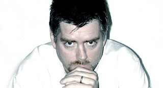
This an interview I did in the summer of 2007 with Kyle Cooper, the designer who revolutionised the movie title-sequence industry with Se7en, and who remains one of its leading lights today
“To be honest, I always wanted to be a film director,” begins Kyle Cooper, when we ask what first appealed to him about title design. It’s a surprising revelation from someone considered among the elite of title designers, but a logical one. “I thought by getting into film titles, I could find a way into the film industry itself,” he explains. Despite Kyle’s solitary director credit (2001’s New Port South), one can easily argue he’s more than achieved his goal—but instead of helming films, he’s been responsible for dozens of stunning title sequences, including those for Spider-Man, Wimbledon, Dawn of the Dead, and Se7en.
Kyle continues: “I’ve always been interested in film and editing—more specifically, the juxtaposition of images in film or on a single page. However, I felt it more comprehensive to tell stories over time. Print design can provide great single moments, but I wanted to work with a sequence that had a beginning, middle and end.” This passion, which began in childhood, continued through Kyle’s education at Yale School of Art, and into initial roles in the creative industry. “I got a job at R/Greenberg Associates in New York, who were known for opening titles at the time,” says Kyle. “The first main title I was allowed to pitch for was Martin Scorsese’s Life Lessons. I won, and was promoted to managing the design department.”

Start with the prologue
In time, Kyle moved on to even bigger and better things, eventually founding the company he runs today, Prologue. With an initial aim to “do main titles and motion graphics as progressive as what was happening in print and other areas of graphic design,” Kyle has made good on this promise, creating visually exciting titles with impact. Partly, this is down to his philosophy that titles are far more than a list of credits: “Titles must be born out of the content of the film itself—they’re in service of the film’s story, and even if they’re visually interesting, they should have a deeper meaning and connect with the movie’s characters.” Many factors must be taken into account, including the director’s wishes. “A director is the gatekeeper to what the final film will be,” notes Kyle, “and so it’s my job to service those needs and make something that dovetails perfectly with the director’s point of view”.
Studios can also affect title sequences, as Kyle explains: “What’s interesting about the way I’m currently working—and, coincidentally, the reason for naming my company Prologue—is that studios are screening films to test audiences and realising something else is needed after principal photography has been shot. The audience may have missed something about the plot, and I’m asked to use the title sequence to help tell the story. Many sequences I’ve done as Prologue have become the film’s prologue: the main titles of Se7en and Dawn of the Dead became the first scene in each movie. If those sequences weren’t at the beginning, the overall impression and understanding of the films would have been different.”
These things, according to Kyle, highlight an important aspect of title design: “When collaborating with other people, you cannot always have the definitive answer—you have to allow ideas to evolve, and that comes from listening and talking things out.” Because title design involves working on varied projects—each production typically taking just a few months—it’s also important to tailor the visual design to each specific movie. “I try not to let one project influence the next, and don’t bring a ‘style’ to each movie,” says Kyle. “New ideas result from keeping my work informed by each film’s content, context and voice. Because each film is a different problem to solve, each solution is different. The process of researching, experimenting and exploring fitting ideas for each film leads to unforeseen and unexpected answers. The opportunity to be innovative comes by immersing oneself in a film and being true to the work.”

Old versus new
Perhaps surprisingly, given the dynamic, cutting-edge nature of many of Kyle’s projects (think of the movement in the webs, text and imagery in the Spider-Man titles), he considers technology something of a double-edged sword, and favours old techniques: “I try to do as much as possible in the camera, or with my hands, although that’s increasingly hard to do today”. At Prologue, technology inevitably gained a foothold, but Kyle stresses that “tools do not dictate the direction of ideas,” and warns: “While technology enables certain modes of production, it does not provide a good story nor clear communication nor a beautiful image!”
What technology does provide is a means for Kyle to improve his exacting attention to detail: “I like designing in the edit room, because it gives me an opportunity to see every frame that has been designed and animated, and manipulate those images accordingly. I review composition on a frame-by-frame basis, which I realise is unusual in this field, but not in respect to the framework of my graphic design background and training. I truly want every frame in the sequence to be a beautiful, perfect composition.”
For the industry’s future, Kyle thinks a mix of new technology and traditional ideas will lead to many more classic title sequences. Technical innovations bring the potential for increasingly complex films, and few limits exist regarding what can be done. Kyle reckons advances in CGI and motion-capture are leading to a point where viewers won’t be able to distinguish something photographed from computer generated imagery, and so main titles will “become anything that can be imagined”. Ultimately, though, Kyle thinks the keys to successful titles sequences remain timeless: “They should make you feel something emotionally, and make you thrilled to be in a particular cinema at a particular moment, getting ready to see a particular movie. We strive to make everything else in the world go away except the curiosity, excitement, and feeling of anticipation for the film you’re about to see. If you’re already immersed in the emotional tone of the film or have insights into the main character’s thought process before the film begins, we have achieved what we strive for, and I hope the work we create continues to emotionally engage people in this way.”

Comments Off on From the archives: an interview with Kyle Cooper