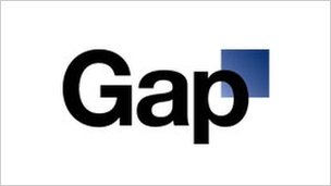
Gap logo fiasco or PR stunt?
BBC News reports that Gap’s scrapping its new logo a week after introducing it, after thousands of people told them it was utter bollocks. They cunningly binned a well-known, iconic logo and replaced it with generic, dull type that had a blue square behind it. Or did they?

The more I look into this story, the more it reeks of a PR stunt. Scrap a logo, replace it with something that looks like it was knocked up by a junior web designer, wait for the vitriol, get publicity. And then, when the ranting’s at its loudest, say the following:
We’ve been listening to and watching all of the comments this past week. We heard them say over and over again they are passionate about our blue box logo, and they want it back.
So we’ve made the decision to do just that—we will bring it back across all channels.
Those are the words of Mark Hansen, president of Gap Brand North America, who didn’t go on to say: “Ha! We pulled the wool over your eyes, didn’t we, you stupid idiots.”
Mind you, he did add a rather worrying point that suggested maybe this wasn’t a stunt and that Gap really doesn’t know its arse from its elbow regarding branding. He said Gap “did not go about this in the right way” and “missed the opportunity to engage with the online community”. Er, what? The last thing you want to do is ‘engage with the online community’ regarding your branding, because the online community knows shit. All you’ll get are people moaning about any kind of change, or offering My First Logo™ designed in MS Paint, which they naturally think is also The Best Logo Ever™ and ignoring the fact that a logo and a brand aren’t the same thing.
When it comes to branding, engagement is key, but you talk to your customers about what they think your brand represents; you talk to your staff; you figure out what you’re trying to say. You don’t open it up to the world, creating a brand designed by the largest committee possible, otherwise you end up with something even worse and more watered down than what Gap was using until today.
Point well made. If the company really believed in revamping their logo to convey a new identity they should have done their homework in understanding the consumer sentiments rather than assuming it. Now that they have reverted to the old logo either means nothing has changed in the business or they don’t have the courage to communicate the changes.
Cheap publicity is bad publicity.