Liquid Glass: Apple vs accessibility
The keynote for Apple’s developer conference was held yesterday. Much of it involved Apple executives hyping Apple’s “delightful and elegant new software design”. In short, it’s like Windows Vista, visionOS and the interfaces in Minority Report had a baby. As I explain in a column for Stuff, I’m not thrilled about this new direction.
Online, I’ve seen plenty of pushback against those complaining. A common thread appears to be that Apple is a leader in accessibility and there are options to turn some Liquid Glass elements off. But there are problems with that point of view.
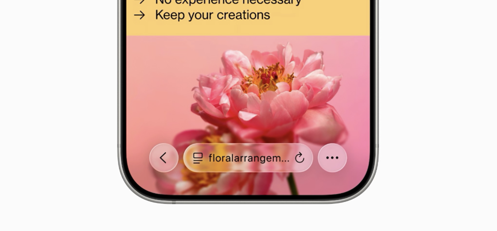
While I’m more writer than designer these days, I was trained in the visual arts. I was always taught that clarity and legibility should be at the forefront of anyone’s mind when designing. Surely, that’s even more the case when creating an operating system for many millions of users. Yet even in Apple’s press release, linked earlier, there are multiple screenshots where key interface components are, at best, very difficult to read. That is the new foundational point for Apple design. And those screenshots will have been designed to show the best of things.
Furthermore, Apple may be a leader in accessibility, but it is far from perfect. I first wrote about vestibular issues on this blog, back in 2012. But it was the following year, with a piece for The Guardian (Why iOS 7 is making some users sick) that the word got out there regarding major accessibility issues with a new design language. To Apple’s credit, it did listen. Changes happened. The iOS team in particular has been very responsive to my recommendations – and I’m sure also to those from others.
But the key word is responsive. Apple is still very often reactive rather than proactive regarding vision accessibility. Even today, there are major problems with the previous versions of its operating systems (one example being the vestibular trigger if you tap-hold the Focus button in Control Centre). One year on, they aren’t fixed. And now we have an entirely new design language that will upend everything and that starts from a place where clarity has been eroded, animations are even more prevalent, and broad accessibility is seemingly an afterthought.
My hope is that there will be time in this beta run for enough fixes to be made. My fear is that many of us will be waiting months for a fully usable OS, if that ever occurs. So, sure, argue against what I and others are concerned about. State, correctly, that Apple is a leader in accessibility. But stop assuming that just because this new design might be OK for you and because Apple has controls in place that might help people avoid the worst effects of design changes, everything is just peachy. Because it isn’t. Millions of people are now a coin flip away from whether or not they’ll be able to comfortably use their devices in just a few short months from now.
[…] Craig Grannell on OSes 26s: […]
[…] „Liquid Glass: Apple vs accessibility“ | Craig Grannell […]
[…] Craig Grannell: […]
[…] Apple Versus Accessibility ➝ […]
[…] say iOS 26 and iPadOS 26 have been divisive is putting things mildly. Much of that is down to Liquid Glass, which at best needs a lot of optimisation before these operating systems ship later this year. But […]
[…] Liquid Glass: Apple vs accessibility digs into the accessibility implications of Apple’s new design language. […]
[…] https://reverttosaved.com/2025/06/10/liquid-glass-apple-vs-accessibility/ […]
[…] like text/background contrast has taken a hit. I haven’t seen a full throated takedown of it yet (there are some mentions though), but I imagine that’s coming. There are already settings in there to tone […]
[…] like text/background contrast has taken a hit. I haven’t seen a full throated takedown of it yet (there are some mentions though), but I imagine that’s coming. There are already settings in there to tone […]
[…] Apple’s current design trajectory. There’s a lot of gloss – style over substance – with Liquid Glass. While I appreciate some refinements, like the quiet exit of the Home indicator, the more I use […]
[…] very wrong over Cupertino way. Sure, the macOS Finder icon is now 73% less hideous. But Liquid Glass has so many problems, the new alarm design on iOS is abysmal, and then there are […]
[…] and I appear to be in very different spaces this year, though, with my position on Liquid Glass being significantly more negative. I see gloss – a pretty tech demo that also serves to […]
[…] auch hier […]