This is why we can’t have nice things

I yesterday wrote about Tap! magazine, largely about the editor’s belief that you can’t just review iOS apps in a few minutes. However, he also showed off the accelerometer-aware cover. Sure enough, one of the commenters got all angry about this:

It’s “accelerometer aware”…. who actually gives a **** about this? It “organically appears” … please, just show the damn content! What a bunch of pretentious bollocks.

One of the best things about Tap! is the manner in which the team has experimented with a new medium. Sure, you don’t need to have an accelerometer-aware cover. Similarly, last issue, the in-house guys didn’t need to animate my Plants vs. Zombies How To Win feature and Graham Barlow’s cover feature on apps and games for kids. But these things are nice-to-haves (similar to—although not identical to—layout flourishes in print magazines that go beyond pure readability), and Chris Phin in the video comes across like a proud craftsman, showing off his team’s work, the result of their trying new things and experimenting with a nascent medium.

Sure, the video could have just flipped through every page, which would have been boring as hell, much in the same way Tap! could have reformatted itself as ‘Instapaper with pictures’, which wouldn’t have been nearly as appealing as a magazine that begs to be interacted with and that’s trying to do something new rather than remain rooted in the past of magazines and newspapers.

July 13, 2012. Read more in: Apple, Tap!

4 Comments

It really annoys me when I see people reviewing iOS apps badly

Editor Chris Phin previews the latest edition of Tap! magazine on YouTube, but along with showing what’s inside, he also provides some thinking on iOS reviews in general:

It actually really annoys me when I see people reviewing iOS apps badly. It’s easy to just read an App Store description and tag on a mealy-mouthed, not very definitive verdict at the end of that.

This is something that I’m finding’s becoming increasingly common. I’ll often see reviews of iOS games and apps that make judgment calls that only relate to a few minutes’ use. In Tap!, Chris notes that we don’t do this (I’m the games editor, as regular readers here will know), spending hours with games and apps, to make sure we provide a verdict that comes from extended use, not just a quick look. In some cases—*cough*Hero Academy*cough*—we perhaps spend a bit too much time on a single product, but there you go.

Still, this isn’t the only thing that annoys me from a Tap! perspective. People still bang on about magazines being rubbish on the iPad (something I wrote about in March) and, more recently, argue the iPad’s corner in terms of content creation. Bizarrely, Tap! almost never gets a mention, despite being a magazine designed specifically for the iPad and that’s actually put together on an iPad and in the iPad simulator on a Mac. (More on Tap!’s creation can be found in this YouTube video.)

It frustrates me that Tap! isn’t more well known, but delights me when I receive feedback from readers, which is almost universally positive. If you own an iPad and fancy checking out Tap!’s reviews, features, and the developer section (by the amazingly talented Matt Gemmell), grab a copy from http://tapm.ag/appedition. Individual issues are three quid, but there are a also a few previews that let you try before you buy.

July 12, 2012. Read more in: Apple, Tap!

2 Comments

The future of media on mobile and iPads isn’t about web beating apps, but better planning and implementation

Here we go again—another article that says the future of magazines is in the web and not apps, and that apps are rubbish, largely because the apps that have been made so far are mostly sub-standard, presumably because the people driving them are making mistakes. I’ve written about this before, but the Technology Review piece I’m referencing needs looking at in more depth, because it often reads like a laundry list of  screw-ups you can make regarding apps and the thinking involved behind mobile, rather than a serious argument for the web over native apps.

As a rather good starting point, tech journo and app developer Tom Royal tweeted the following earlier today:

That ‘Publishers don’t like apps’, thing spectacularly misses the point. *Readers* like apps. Publishers like having readers.

Bear that in mind.

So, Jason Pontin, editor in chief and publisher of Technology Review, starts off in his article by claiming traditional magazine publishers were

overtaken by a collective delusion

when the iPad first appeared, in that they’d be able to

unwind their unhappy histories with the Internet.

The web, he argued—rightly—has led to an expectation of free when it comes to a lot of what was previously print-based journalism and other editorial content. He then states publishers considered tablets a means to return to simpler times, through form factors that are, to some extent, similar to paper publications. Native apps could deliver interactive digital magazines, which would have the functions of true software, rather than merely being a website compiled from mark-up and scripts.

Pontin argues that publishers then lost their heads:

Publishers believed that because they were once again delivering a unique, discrete product, analogous to a newspaper or magazine, they could charge readers for single-copy sales and even subscriptions, re-educating audiences that publications were goods for which they must pay. They allowed themselves to be convinced that producing editorial content for the apps and developing the apps themselves would be simple.

Immediately, this paragraph makes me twitchy. This isn’t so much a strike against the idea of apps as against the arrogance of managers and publishers thinking an entirely new medium would be easy to develop for and conquer. It’s no different from people prominent in movies thinking: “Gaming? Pah! We’ll nail that easily. After all, we already do moving pictures, and games are just moving pictures you can control.”

Pontin continues in noting that software vendors

promised that publishers could easily transfer editorial created on print copy management systems like Adobe InDesign and InCopy directly to the apps. As for software development … well, how hard was that? Most publishers had Web development departments: let the nerds build the apps.

Again, this strikes me as an error in management, not any kind of drawback of the medium or format. Digital mags are not the first time we’ve seen the ‘write once, deploy anywhere’ sentiment, and history has shown such an ideal to rarely—if ever—work. In believing—or wanting to believe—that you could, with very little work or outlay, take your print material and just pipe it into an app, those managing publications were, at the very least, knowingly deciding to take a shortcut. They didn’t have to do this—it was to do with cost-effectiveness and speed, rather than quality and optimisation for the platform.

Pontin then talks a little about advertising and how apps were supposed to revitalise print-oriented ad models, rather than the much more cutthroat advertising you see online, based heavily on click rates and ad impressions. He says he ‘succumbed’ and decided to release apps that would enable anyone to read Technology Review’s daily news for free, and buy digital replicas of the magazine. With a budget of $125,000, 5,000 subscriptions and a handful of single issue sales were needed, but everything went wrong.

Initially, Apple’s inability to offer subscriptions caused problems, and I certainly wouldn’t defend Apple in this regard. Those entering the app-mag space early on did have their work cut out, figuring out how to deal with selling content—but this has since changed with Newsstand. Pontin also complains about Apple’s 30 per cent cut (despite traditional newsstand outlets taking a massive chunk of every magazine’s cover price—something many people tend to forget) and ‘adaptation’ of publications to apps.

A large part of the problem was the ratio of the tablets: they possessed both a “portrait” (vertical) and “landscape” (horizontal) view, depending on how the user held the device.

I have no idea why this is a problem. Steve Jobs himself famously argued that one of the most important things in design is learning to say no. Although the ability to switch orientations is a nice-to-have, it’s not essential. Tap! magazine only works in portrait mode, and is none the worse for it. I wasn’t party to the reasoning behind this decision, but I’ll bet it had something to do with resources—in wanting to focus on getting one really good orientation out the door rather than two sub-optimal ones.

However, Pontin says most publishers have ended up producing many different versions of their editorial product: print, PDF, landscape for tablet, portrait for tablet, a ‘hack’ for smartphones, and HTML for online. At this point, I see duplication and mismanagement. I imagine the majority of the work was in many cases down to a desire for pixel-perfect asset placement on all of these versions of the editorial product (bar the web), rather than creating digital templates in universal apps for iOS (say) and piping content into them, while also sending it to the web.

I do have some sympathy for the layout problem, however (and I know it remains a thorny issue among many editors I work with), but the next one beggars belief:

Software development of apps was much harder than publishers had anticipated, because they had hired Web developers who knew technologies like HTML, CSS, and JavaScript. Publishers were astonished to learn that iPad apps were real, if small, applications, mostly written in a language called Objective C, which no one in their WebDev departments knew. Publishers reacted by outsourcing app development, which was expensive, time-consuming, and unbudgeted.

Again, this isn’t a problem with the platform or apps in general—it’s a problem of management and research. Going back to my gaming example, would movie directors be ‘shocked’ to learn that you need more than a camera to create a videogame? Then why were people surprised to find iPad apps were applications, using technology different from websites?

Pontin continues, arguing these expensive, time-consuming and unbudgeted apps also happened to lack essential features:

But the real problem with apps was more profound. When people read news and features on electronic media, they expect stories to possess the linky-ness of the Web, but stories in apps didn’t really link. The apps were, in the jargon of information technology, “walled gardens,” and although sometimes beautiful, they were small, stifling gardens.

Yet again, we’re not talking about a problem with apps, but of the apps that were created, often using specific systems. I recall downloading an early edition of Wired on the iPad. It was essentially a set of rendered images, with very little interactivity. But to return to Tap! again, every feature can be tweeted about (reviews will link through to the website’s version), and every piece of body copy can be sent to the clipboard and pasted into another app. Just because a lot of apps leapt aboard the ‘app mag churn’ train, that doesn’t mean apps are inherently bad any more than dross regularly topping the pop charts makes music a bad thing.

Pontin concludes that owners of mobile devices are now largely anti-app, only using websites or perhaps “glorified RSS readers”:

A recent Nielsen study reported that while 33 percent of tablet and smart-phone users had downloaded news apps in the previous 30 days, just 19 percent of users had paid for any of them. The paid, expensively developed publishers’ app, with its extravagantly produced digital replica, is dead.

If this is indicative of the entire audience, one in five paying for your content isn’t necessarily a bad thing, and the problem becomes conversion rather than apps. When Future first launched its many iOS mag apps, this was one of the things that in some cases hadn’t been fully considered. Users would download an app and be hit with an immediate brick wall, in the form of a demand for payment. Now, the majority of apps ship with preview editions or the odd freebie, enabling device owners to try before they buy. Some even enable you to flick through an entire mag in low-res, before clicking buy, and I’d love to know what effect this has had on sales.

But Pontin won’t be swayed. He says Technology Review sold just 353 subscriptions, never discovered how to avoid the necessity of designing landscape and portrait versions, fought and wasted money. He says he hated the experience

because it tried to impose something closed, old, and printlike on something open, new, and digital.

I’d argue that apps aren’t necessarily about imposing anything—it’s all in the execution. Yes, you can create something closed, old and print-like, but there’s absolutely nothing stopping you creating something relatively open, new and digital. Sure, examples of fantastic mag and newspaper apps are rare, but they do exist, and that they do exist means they are possible for every publisher to create. It just needs research, planning, good management and a strong, dedicated team, along with all the great content you had in the first place.

That’s not to say native apps are the only way. Technology Review plans to follow in the path of the FT’s successful ‘HTML5’ app, which works cross-platform and cross-device. However, the FT’s decision was made for many reasons, not least its reliance on having plenty of information about its subscribers, which Apple wouldn’t provide access to. I’d also bet much of its success has been down to having a core audience of wealthy readers willing to pay and also willing to move over to whatever platform the FT decided it wanted to support. Additionally, it’s not like the FT web app sprung up out of nowhere, for free. Anyone deciding on going ‘web app’ rather than (or in addition to) going ‘native app’ will have to be mindful of not making myriad mistakes along the way, in terms of investment, optimisation, social sharing, payments, and more.

Perhaps the web will win out in the long term, but as developer Matt Gemmell said when I recently interviewed him for .net, native apps will always possess advantages over websites/web apps, in being more fully integrated with the system and not having to spend resources aping native APIs and features. This often results in products that readers like to use, and this naturally has the potential knock-on effect of snaring more readers—if the product is good enough. It’s therefore up to those people creating magazine and newspaper apps to take advantage of the technology, plan carefully, and ensure they’re not just creating digital facsimiles of their print products; should they do so, I’m sure we can look forward to many more first-rate mag apps, rather than the handful available at present.

May 9, 2012. Read more in: Design, Magazines, Technology

4 Comments

A quick look at the future of digital magazines, today: Tap! magazine

In March, I wrote Why do magazines look so bad on the new iPad?, which fast became one of the most-read articles published on this blog. It was essentially a response to a Mashable article that attempted to explain why most magazines looked terrible on the new iPad. Since then, I’ve seen plenty of similar articles, arguing that the iPad’s Retina display has been tough for publishers, because the tools they use mostly export to rendered flat images at a set resolution rather than using native text. And every time I see such an article, my heart sinks a little, because they bang on about the future being PDFs and also inevitably fail to mention Tap! magazine.

I was invited to write for the launch issue of Tap! by editor Christopher Phin, and have edited the games section since then. From the very start, Tap! strove to be different. Mostly, this was down to the content: it had lively and punchy copy, and the reviews weren’t just rewritten press releases/App Store descriptions with a quick half-opinion bolted on the end.

Initially, the app was distributed digitally on Zinio, but there had always been plans to launch an app. Instead of simply churning out a PDF wrapper, the team built its own solution, and the workflow involves creating each issue on iPads or in the iPad simulator on a Mac. John Gruber recently referred to Cargo-Bot, an iPad game created on the iPad, as a “glimpse of the future”, but the iPad version of Tap! has been made on an iPad for months now.

However, technology isn’t the most important thing about a magazine: content is. As journo chum Gary Marshall points out on Tap! and magazines’ digital future, too many digital magazines that provide anything beyond PDFs treat the medium like it’s the 1990s, offering some kind of experience akin to CD-ROM. With Tap!, interactivity isn’t there for the sake of it—it genuinely enhances the magazine. In the video below, the editor takes you through some of the current issue:

Although there are some cute visual touches in the magazine (such as the particle effects mentioned in the video, which make a round-up on astronomy apps look rather pretty), many of the things that I find most exciting about Tap! are the ways in which it increases usability and directly helps the reader.

In the latest issue, there are quite a few ‘comparison’ shots. These are simple drag-based affairs, but provide a great way to quickly switch back and forth between two images. Examples in Tap! magazine’s May 2012 edition include photos of the new iPad screen and that of the iPad 2, and a comparison of photo filter apps.

Tap comparison between iPads

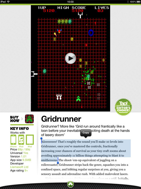
In the Games section, each review has a screen grab, but there’s also an in-context embedded video of the game, so you can get a better idea about it. These are also created in-house, so they’re not marketing fluff. Additionally, as the following grab shows, Tap! text is native, and so it can be copied and pasted. The mag also has built-in search and social-sharing functionality.

Tap! games review

Other reviews also benefit from relatively subtle interactivity. In the Kit section, some of the images can be spun through 360 degrees. Again, this benefits the reader. Most press shots get a piece of kit’s best side, but in Tap! you can see if an expensive speaker looks good from all angles.

Tap! 360 degree pic

And from a purely content-oriented perspective, Tap! still goes a bit beyond, for example including a developer column by beardy coding wizard Matt Gemmell.

Tap! dev zone

The Tap! app is available on the App Store, for free, and several previews are available for download. If you fancy experiencing an iPad magazine that looks fab on the new iPad (the latest update is fine-tuned for Retina, although it looked lovely anyway) and also has great content,  I urge you to give it a try.

April 25, 2012. Read more in: Apple, Design, Magazines, Technology

1 Comment

Why do magazines look so bad on the new iPad?

Mashable’s Lauren Indvik writes about magazine apps looking bad on the new iPad. She mostly refers to publishers who wanted to retain print-like magazine design and therefore cunningly churned out rendered PNG or JPEG files for each page, rather than using native text. Now the new iPad has a resolution far greater than that of its predecessor, these magazines all look like blurry crap.

Indvik lists a bunch of examples, stating they all looked terrible, and noted that Vogue was the sole exception, because the company

was able to optimize for the iPad’s “retina display” ahead of time

She then worries about file-sizes, stating that magazine apps are already big enough, and so we could see titles ballooning to unworkable levels. The problem is in the methodology used to create the apps:

Magazine publishers who use Adobe’s software all begin with InDesign to develop layouts, [Zeke Koch, senior director of product management of Adobe’s digital publishing arm] explained. Those layouts can then be exported in three different kinds of formats: as images (.png or .jpg), PDF or HTML. Different kinds of files — images, for instance, or video and audio files — are embedded within those larger file types.

Since magazines began publishing on tablets, “virtually all” publishers have chosen to export their digital editions as PNG (.png) files, Koch said. “The primary reason they did that is because the fidelity is perfect. What you see on the desktop when you’re designing is exactly what you see on the iPad when you’re finished. Images are the fastest thing to load, and if you’re trying to create a quick, effortless browsing experience, images are the way to do that,” he explained.

One of the magazines I write for, Tap!, took a wildly different approach. Instead of designing its app by thinking like magazine designers, the team started with a blank canvas and designed an app (YouTube). It developed a publishing platform that works on the iPad (TechRadar), to create a digital magazine for the iPad. The net result is that Tap! looks great on the new iPad, largely because it’s using native text rather than rendering to flat images. It looks so good that a prominent UX designer I recently chatted with initially refused to believe me when I said the app had not yet been optimised for the new iPad.

The Tap! team isn’t blind to Apple’s new device. It is working to optimise those relatively few components that require optimising for the next issue, but because of the nature of the app itself, it will grow rather more subtly than its contemporaries. To my mind, this is a way forward: create something new and don’t root yourself in publishing’s past. This is why the following claim from Indvik’s article almost makes my brain explode:

What Vogue did — and what all other titles will have to do in the coming weeks — is begin exporting their digital editions as PDFs, said Koch.

Great. Bin any innovation in magazine apps in terms of navigation and new interfaces and return to literal virtual versions of magazines. And it doesn’t end there:

But what about file size? I pointed out to Koch that Vogue was nearly as large as Wired‘s first issue for the original iPad. Unfortunately, he said, magazine files will be larger for iPad 3 readers because the image and video files need to be delivered at a higher resolution.

There are ways around this. Tap! doesn’t hold videos locally, but pulls them down on demand. From a user experience standpoint, this does mean if you’re on a crappy connection you can’t watch the videos, but it also means that a few issues of the magazine don’t fill up your iPad. It’s about balance, which, to my mind, is what a lot of the future of publishing is about. Trying to cling on to the old ways of doing things will prove fatal to the industry.

Indvik does at least ask about an alternative in her piece, essentially treating mag apps as compiled websites:

But why not render in HTML? I asked Koch. Wouldn’t that make the files smaller, and give readers the added benefit of selectable text?

Koch claimed that publishing in HTML wouldn’t substantially reduce the file sizes. “In both cases, you have a bunch of words, and descriptions of where things should be, and multimedia. Those multimedia files are still the same size.”

I’d argue this is inaccurate. Native text is smaller than rendering text to flat images—even newbie web designers understand this. It’s also ignoring the accessibility drawbacks of rendering to flat images.

To be fair to Koch, he’s also talking about overall file sizes, because assets like video won’t drop in size, but I’ve already addressed this point. But he also makes an argument that is the crux of the matter, showcasing why so many publishers are working with systems that are not optimal for tablets:

He said the big disadvantage with HTML is that it’s “not very good at layout out things predictably and perfectly.” Rather, it’s optimal for helping people create content that will adapt to any size screen. [sic]

This pretty much sums things up: ‘predictably and perfectly’. Almost everything in digital magazine publishing reminds me of web design in the mid-1990s. Back then, I had to fight hard against people who would attempt to render entire web pages as images, because this would enable everything to be laid out precisely. Never mind the fact this screwed things up from an accessibility perspective, and also totally ignored the benefits of the new medium. But at least there was some excuse back then—browsers were basic and no-one had experience to draw on. The arguments were new. Today’s web standards, however, provide a ton of control from a typographical and layout standpoint, but things are just different to how they are in print. You define anchor points and containers within which your content can move and shift, reflowing depending on the needs of the user.

But the thing is, Tap! showcases that you needn’t just jump from PNG to PDF to HTML: there are alternatives to all of these things that give you enough precision while also providing accessible content that enables you to keep more than a couple of issues on your iPad before being forced to delete your entire music collection. Again: try something new. Build for the medium. Start with a blank canvas, not a readymade that essentially forces you into a particular way of working that is not optimal.

The article’s conclusion is particularly maddening in this respect:

So there you have it. Magazine readers need not despair about the appearances of their magazines for too much longer, as publishers are working to optimize their editions. The fix is relatively simple: publishers will have to increase the resolution of their image and video files, and export their digital editions as PDFs. iPad 3 owners will have to suffer longer download times, and won’t be able to store as many magazines on their devices as iPad 1 and 2 owners, but that’s the price one pays for a visually stunning reading experience, no?

No. That’s the price we pay for publishers not following Apple’s own advice and thinking different, instead choosing to cling to the wreckage of essentially deprecated ways of working.

Further reading: Tap!’s editor weighs in on the new iPad’s display and the supposed bloating of magazine apps.

March 26, 2012. Read more in: Apple, Magazines, Technology

9 Comments

« older postsnewer posts »