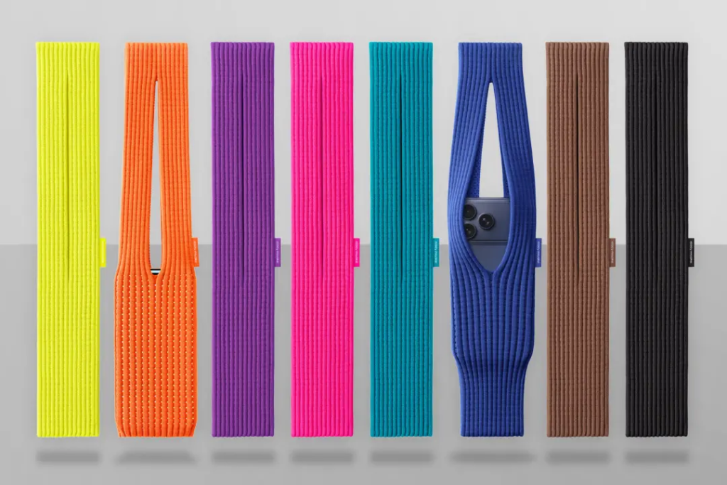
Apple reinvented iPod Socks. But because this is 2025, they’re now ludicrously expensive fashion items. Read more in my column about iPhone Pocket for Stuff.
Apple will soon sell a Mac that uses an iPhone chip.Which makes it even more absurd that, unlike Android 16, you can’t use your iPhone like a laptop. I unravel all this over at Stuff.
Which is the best iPhone ever? You probably won’t agree with me, but it did take bloody ages to update this list for Stuff, so don’t yell at me too much about it.
Astronomy. Every time I think of the word, I get that Dara Ó Briain sketch in my head, where he explains how to forever remember which is the good one from astronomy and astrology. In short: Astronomy. Nommy. Yes, I know. But I’ll take that to the grave. Anyway, I wrote a feature about using Night Sky to explore the heavens.
We don’t live in a paperless world. Yet. Fortunately, then, iPhone document scanners exist. Here are my favourites, in a round-up for TapSmart.
Another visitor! Stay a while! Stay forever! If you’re of a certain age, you’ll remember Elvin Atombender yelling this via your C64. What you might not know is folks are beavering away on the third entry on the series, and it’s looking great.
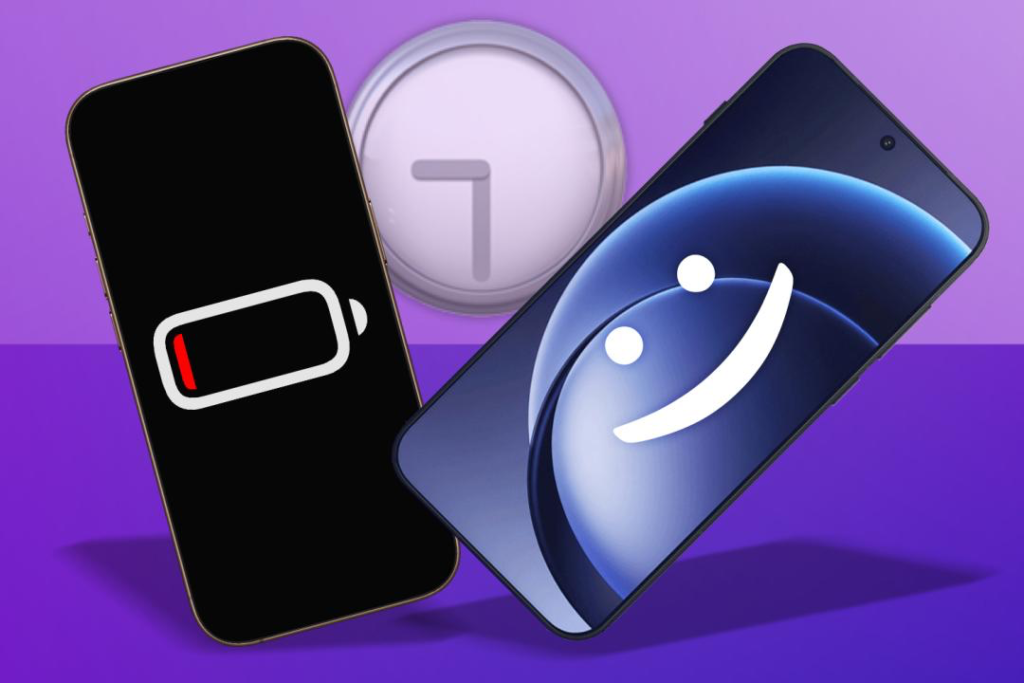
My iPhone 16 Pro battery isn’t great. And yet it’s also healthy, according to the Settings app. Still, it’s disappointing that I often head towards the end of the day with the phone gasping for a charge. Which is why, for once, a spec on an Android phone excited me, leading me to write I want Apple to squeeze a OnePlus 15 battery inside my next iPhone.
Mac icons are now dreadful. So says Paul Kafasis, who systematically dismantles Apple’s new design style, ably supported elsewhere by John Gruber. Honestly, I’m not sure what’s going on at Apple right now. The broader issues with Liquid Glass don’t say good things about taste, usability and basic objectivity. These icon changes starkly show all these problems in microcosm, with most of them being significantly worse from aesthetic and usability standpoints.
The customer experience is all-important. So says Ken Segall, who argues Tim Cook’s Apple increasingly crosses a Steve Jobs red line. The whole ‘What would Steve Jobs do?’ thing is dangerous territory. A company has to move on when a founder is no longer around. But I’ve long felt Apple too often shifts under Cook from ‘be the best’ to ‘be least worst’ regarding customer experience. Infesting Maps with ads, which Segall suggests is rumoured, would be another step into the bad space.
The App Store is now online. This one deserves a finally. When you look up an app in Safari on Mac, you no longer get a preview page that immediately attempts to load the Mac App Store – and, in my case, then causes a vestibular trigger that makes me dizzy. You can now search and browse categories. But can you buy anything online and, say, load an app on to your iPhone, ready for when you next use it? No. Incredible. I mean, it’s not like you’ve been able to do that on Google Play for years and years.
A Vectrex Mini is coming.I wrote about this for Stuff, and it’s a mini console I never imagined would happen. The Vectrex is also a console I always craved but never bought. These days, they are expensive units – and also fragile. Not an ideal combination. The Mini lacks a CRT, which has made some folks grumble. Although not to the degree it impacted the Kickstarter, which was fully funded in 15 minutes. And from an authenticity standpoint, the Mini will at least get physical overlays that ape the originals (with a digital fallback if you use a game where you don’t have an overlay). Even better, the unit turns into a gloriously geeky desk clock when idle. So, yes, I want one.
I updated some Apple articles:iOS 26 tips (Stuff) and my iPhone and iPad buyer’s guides (both TapSmart).
Star Trek Lego is boldly going, etc.I covered the new set for Stuff, cramming in as many puns as I could get away with. Engage! Etc.
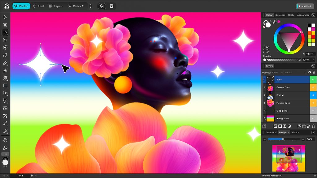
Affinity is now free. Early in October, photo editors and designers rightly lost their minds as the Affinity suite was pulled from sale. Cue: catastrophising about inevitable enshittification – perhaps by way of a subscription or Affinity being mashed into Canva with a fork. Nope. As I covered for Stuff, Canva’s massive curveball has been to make Affinity entirely free.
The internet still lost its shit over this. Why? I’m not sure. Presumably, people just don’t trust big tech companies anymore – and that’s fair enough. They’re waiting for the other shoe to drop. A Canva co-founder even put out a new video yesterday to outline the company’s reasoning. TL;DR: by making Affinity free, more photo editors and designers will use it. When more people use it, teams will scale in Canva, which means more subscriptions. Oh, and Adobe gets a kicking.
Hashtag remindme 1 year etc etc. But my take, right now, is that this is all a net positive in terms of more widespread access to high-end design tools. And, as I said in my piece for Stuff, Adobe should be very worried indeed regardless.
Apple’s Family Sharing helps keep children safe. Until it doesn’t. That’s my latest for Wired, which explores a rarely considered dark side to family sharing – and similar systems by other companies – that can leave children’s digital lives ‘trapped’ within coercive and abusive relationships. Apple, Google and Microsoft should take heed and rethink how they deal with family breakdown. Whether they will or not, who knows? (My experience of Screen Time and Family Sharing suggests not many sufficiently senior people at Apple are actually using these tools, because otherwise they’d be a whole lot better.)
Google is free, so why pay for Kagi search on your iPhone?I spent a month with Kagi to find out. In short, it’s great. And that’s in part because the underlying thinking behind the service is human. Kagi trusts you’ll like it enough to stick around. So instead of forging towards lock-in, Kagi actively encourages you to look elsewhere when you need to. And if you don’t use the search engine for a month, Kagi will credit you.
Apple values change.Jason Snell’s piece for Six Colors has a brutal finale. Doubly so because it’s basically two chunks of copy/paste that starkly showcase how much Apple has changed in just a year, using Apple’s own words.
The terrible new Met Office design is online. I’d hoped the reworked mobile app was a standalone thing. Nope. And given that barely anything has changed during the beta run, I suspect this design is locked. But do give feedback if you hate this revamp, even if it’s unlikely the Met Office will listen. And if you’re a weather wonk, start looking for alternatives to the Met Office’s Temu Yahoo Weather.)
I want to really like the Gamestation Go.I wrote about this My Arcade gadget for Stuff. It’s the most interesting handheld I’ve seen since the Playdate, because it adds extra controls that let you play classic arcade titles as they were meant to be played. Tempest with a D-pad sucks. Tempest with a dial is magic. But My Arcade desperately needs to improve the software on this handheld to sort some dreadful rendering issues and the insanely twitchy trackball.
Simogo is doing exciting things. If you’re all “Simowho?”, this company created the best ever iPad game, in the shape of Device 6. (If you disagree, you’re wrong. Sorry.) Many of its other titles were also stone-cold classics, not least the spectacular Year Walk and one-thumb classic Beat Sneak Bandit.
In part responding to the ephemeral nature of games on Apple devices, the company has reworked a collection of its mobile classics for Switch and Steam. And there’s also a book, now available for pre-order, that looks into the creation of Simogo games. I’ve been fortunate enough to interview Simogo in the past and so I imagine the book will make fascinating reading. But I know for sure that the Switch/Steam collection is superb, and so if you fancy a new collection of games to see you through November, get a copy now.
Ikea’s tiny smartphone bed isn’t as stupid as it sounds. The company’s weird little bed for your phone received a mix of ridicule and love online. In this week’s Stuff column, I outline how psychological tricks such as this really can help you combat smartphone overuse.
I reviewed the iPhone 17. TL;DR: it’s the iPhone most people should buy. Are you most people? Read the review to find out.
The Sega Master System is 40.Sort of. The Sega Mark III that morphed into the SMS in 1986 turned 40 last week. Either way, this was a good excuse to write about Sega’s 8-bit machine for Stuff. (Also: the PS2 hit 25 in the US, and so I bumped a piece about that console too.)
The Commodore Amiga is back. Again, sort of. Retro Games Ltd is releasing another plug-and-play telly box, but this one is an Amiga 1200 (minus Commodore branding) with a full-size keyboard. I wrote about it and the revamped THEC64 Mini for Stuff.
Halloween is on the way. Wooooo! Etc. If you want some iPhone apps and games to celebrate the scariest of days, then check out my Halloween apps and Halloween games round-ups for TapSmart.
Kagi News wants you to stop doomscrolling. Having rethought search engines, Kagi is taking on news provision, largely shaking things up by providing a single update every day. It’s a bit like a newspaper. How refreshingly old school. Natch, it won a place in my best free iPhone and iPad apps round-up.
Magazines are being further squeezed. In the UK, WHSmith morphed into TG Jones, and the new owner has continued reducing space for magazines. Our local branch has now shoved them to the rear of the store, and there’s not enough space to face everything. So you have to look behind magazines to see if the one you want might be lurking. I didn’t find any copies of The Week Junior (or the science sister paper). Staff confirmed our local branch still orders it. One copy per week. Good grief.
Tech companies helped destroy the White House. In that sense, it turns out they part-funded it. Good job, everyone! That definitely makes you not appear to be evil!
Lego is releasing a BTTF DeLorean. Only, for some reason, it’s not allowed to call it a DeLorean and so in January we’ll be getting ‘Time Machine from Back to the Future’. Licensing is fun! Anyway, the set looks great, and is part of my new upcoming Lego update.
Sleaford Mods and Gwendoline Christie: not the collab you expected but quite possibly the one you needed.
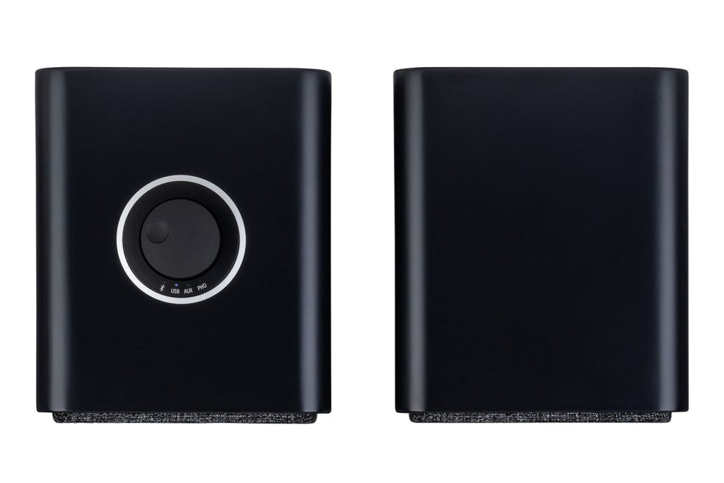
I simplified my audio setup some years back. In my column for Stuff this week, I dig into the reasons why – and find validation in the excellent new Ruark MR1 Mk3 speakers – along with offering a dash of audiophile baiting for good measure.
Little Computer People is 40. I loved this game as a kid. Although ‘game’ is perhaps underselling it. LCP was more like a digital goldfish – a pet person that was proto-Sims mixed with a Tamagotchi. I remain amazed that no one has resurrected it for smartphones, because it would be a perfect pocket companion. Check out the piece I wrote for Stuff about this 8-bit classic.
Moodflow deleted a year of my records. I’m not thrilled about this. The Google Play store is now flooded with angry customers, and there’s almost certainly no way to get the data back. (The app in theory backed up to Google Drive, but another bug apparently signed users out before obliterating their records – including mine.) Safe to say I won’t be writing about this app ever again.
As a child of the ’80s, I grew up with the C64 and ZX Spectrum. I still love how ancient systems tackle imagery. Retrospecs is the best way to process pics as old-school art, from delicate Mac Plus emulation to custom animated ASCII weirdness. It’s now on sale for just two bucks. If you own an iPhone or iPad and have any interest whatsoever in classic computer graphics, it’s a must-buy.