Concept for text editing on the iPad ignores reality

I do like a good concept video, and iPad Keyboard Prototype (YouTube) is certainly that. It explores a new way to edit text on iOS, which is currently a tedious task. You must tap-hold to move the cursor and thereby define a selection point, and getting the right position isn’t fast nor is it always accurate. Selecting characters and/or words is fiddly, although I’d also argue Apple did a pretty good job at figuring out a means of manipulating text by using a piece of glass rather than a physical keyboard and separate pointing tool.

In the video, a new system is suggested, based around swiping. The idea is you slide your finger to move the insertion point and use hold to select text while doing so; a two-finger slide speeds up the cursor’s movement.

The video initially sparks the I WANT THAT reaction, until you realise that it fundamentally contradicts existing behaviours. Apple uses slides and held keys to enable you to move quickly between letters but also to access additional characters. If this prototype ended up implemented in iOS 6, I can imagine a lot of typing issues through systems clashing. You’d have to be slower and more considered in your interactions to avoid this—and then you’re back to square one anyway.

Source: iDownloadBlog, via Jake Desaulniers.

May 4, 2012. Read more in: Apple, Technology

4 Comments

Quasar windowed app system for iPad misses the point of focussed computing

The Verge has reported on Cydia app Quasar, a system that I can’t help feeling utterly misses the point. The $9.99 app for jailbroken iPads

brings window-style app management to the iPad, allowing you to view multiple apps at the same time by resizing, going in and out of fullscreen, switching orientation, and rearranging them on your desktop at will.

I admire the technical skills of the author, but am dumbfounded at the commenters on the Verge piece and elsewhere clamouring for such functionality to be built into iOS. First, the Quasar system is pretty ugly, with chunky ‘Close’, ‘Full Screen’ and ‘Rotate’ buttons. With the assumption Apple would deal with aesthetics, there are still hardware considerations: some iPads have enough trouble running a single very advanced app, and would keel over if you had several running on-screen at once. But even if that problem was eradicated via a new A999 chip that somehow didn’t melt the device and your fingers, there’s the question of focus.

One of the greatest things about the iPad is that it forces you to concentrate on the task at hand—the device becomes whatever app you are using, with a few exceptions (such as background audio) and notifications (which can easily be disabled). Compare this to a PC or Mac running Windows or OS X. You get the flexibility to run umpteen apps simultaneously, but with that comes clutter and distraction. These days, I’m more productive on the Mac when I kill pretty much every app bar iTunes and a text editor. Now and again, I’ll fire up Safari, and I’ll periodically check email and Twitter. But this is how the iPad works by default.

A lot of people consider iOS to be some kind of retrograde step—a return to the bad old days of computing before we could run a whole bunch of apps at the same time. Me, I’m increasingly thinking the more ‘modern’ take of desktop computing was a mis-step. People aren’t programmed to cope well with multitasking; studies have shown that when we are distracted from a task it can then take tens of minutes to get fully back into the task at hand. To that end, any system that can help me concentrate and work better is a boon, not a hindrance, and so even if Apple went mental and allowed Quasar into the proper App Store, I’d still give it a miss.

April 30, 2012. Read more in: Apple, Technology

5 Comments

Disable/remove OS X Lion full-screen transitions with TotalSpaces

In February, I wrote about motion-sickness problems I was experiencing because of OS X Lion. The full-screen transitions on my 27-inch iMac were making me dizzy, meaning I had to stop using them. A couple of weeks ago, I was shown ReSpaceApp, which looked like it could be a solution. The app is now called TotalSpaces and has joined Binary Age. It’s also had an update that brings precisely the functionality that I was hoping for. If you are having the same problems I was, here’s how to set up the app.

Install, then select Preferences from the app’s menu-bar icon. Under Layout, click the top-left grid (thereby reducing the number of desktops to just one) and check ‘Navigate right to full screen desktops’.

Total Spaces

Under Transitions, uncheck ‘Use transitions’.

TotalSpaces

Under Hotkeys, you can define system-wide shortcuts for moving ‘left’ and ‘right’ between your desktop and full-screen apps.

Note that TotalSpaces doesn’t affect transition animations elsewhere—apps still ‘morph’ into full-screen, for example. However, for switching between apps, it does exactly what I needed, meaning I can finally start using full-screen apps in OS X, nine months after the OS first arrived.

April 27, 2012. Read more in: Apple, Technology

Comments Off on Disable/remove OS X Lion full-screen transitions with TotalSpaces

Appy Awards should be renamed Obvious Awards

The winners for the Appys Awards 2012 have just been revealed online, but the “long and star-studded night” might as well have been named Mobile Awards For The Usual Suspects. As someone who sees a lot of mobile apps and games, the final list is flat-out depressing, simply awarding big brands and seemingly entirely ignoring everything else. Regarding the nominations, the Appys site states:

What our staff don’t know about smartphones isn’t worth knowing. Naturally, we harnessed their expertise to bring you a shortlist of nominees across 12 categories in February earlier this year. All that was left was for you, the British public, to vote for your favourites.

Therein lies the rub: the public vote. This isn’t curation—it’s a popularity contest, rewarding the apps people know about already, rather than the best. It beggars belief in 2012 that Angry Birds should be winning any mobile gaming prizes, and that Facebook could win anything with its increasingly broken mobile apps. And while I am a big fan of the new responsive BBC News website, its news app is, at best, an oddball. There are a few choices on that list that don’t make me want to bang my head repeatedly against the desk, but they’re exceptions.

It only gets worse on looking at the nominations section of the website. It’s astonishing to see YouTube listed as ‘best music app’, but when you see it beat Spotify, GarageBand, Shazam and TuneIn Radio, you know this awards contest is garbage. In short: GAH.


April 26, 2012. Read more in: Technology

Comments Off on Appy Awards should be renamed Obvious Awards

A quick look at the future of digital magazines, today: Tap! magazine

In March, I wrote Why do magazines look so bad on the new iPad?, which fast became one of the most-read articles published on this blog. It was essentially a response to a Mashable article that attempted to explain why most magazines looked terrible on the new iPad. Since then, I’ve seen plenty of similar articles, arguing that the iPad’s Retina display has been tough for publishers, because the tools they use mostly export to rendered flat images at a set resolution rather than using native text. And every time I see such an article, my heart sinks a little, because they bang on about the future being PDFs and also inevitably fail to mention Tap! magazine.

I was invited to write for the launch issue of Tap! by editor Christopher Phin, and have edited the games section since then. From the very start, Tap! strove to be different. Mostly, this was down to the content: it had lively and punchy copy, and the reviews weren’t just rewritten press releases/App Store descriptions with a quick half-opinion bolted on the end.

Initially, the app was distributed digitally on Zinio, but there had always been plans to launch an app. Instead of simply churning out a PDF wrapper, the team built its own solution, and the workflow involves creating each issue on iPads or in the iPad simulator on a Mac. John Gruber recently referred to Cargo-Bot, an iPad game created on the iPad, as a “glimpse of the future”, but the iPad version of Tap! has been made on an iPad for months now.

However, technology isn’t the most important thing about a magazine: content is. As journo chum Gary Marshall points out on Tap! and magazines’ digital future, too many digital magazines that provide anything beyond PDFs treat the medium like it’s the 1990s, offering some kind of experience akin to CD-ROM. With Tap!, interactivity isn’t there for the sake of it—it genuinely enhances the magazine. In the video below, the editor takes you through some of the current issue:

http://youtu.be/G3B1yfeD7Bw

Although there are some cute visual touches in the magazine (such as the particle effects mentioned in the video, which make a round-up on astronomy apps look rather pretty), many of the things that I find most exciting about Tap! are the ways in which it increases usability and directly helps the reader.

In the latest issue, there are quite a few ‘comparison’ shots. These are simple drag-based affairs, but provide a great way to quickly switch back and forth between two images. Examples in Tap! magazine’s May 2012 edition include photos of the new iPad screen and that of the iPad 2, and a comparison of photo filter apps.

Tap comparison between iPads

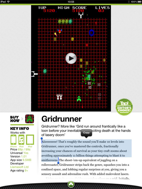
In the Games section, each review has a screen grab, but there’s also an in-context embedded video of the game, so you can get a better idea about it. These are also created in-house, so they’re not marketing fluff. Additionally, as the following grab shows, Tap! text is native, and so it can be copied and pasted. The mag also has built-in search and social-sharing functionality.
Tap! games review

Other reviews also benefit from relatively subtle interactivity. In the Kit section, some of the images can be spun through 360 degrees. Again, this benefits the reader. Most press shots get a piece of kit’s best side, but in Tap! you can see if an expensive speaker looks good from all angles.

Tap! 360 degree pic

And from a purely content-oriented perspective, Tap! still goes a bit beyond, for example including a developer column by beardy coding wizard Matt Gemmell.

Tap! dev zone

The Tap! app is available on the App Store, for free, and several previews are available for download. If you fancy experiencing an iPad magazine that looks fab on the new iPad (the latest update is fine-tuned for Retina, although it looked lovely anyway) and also has great content,  I urge you to give it a try.

April 25, 2012. Read more in: Apple, Design, Magazines, Technology

1 Comment

« older postsnewer posts »