Android + Samsung = crap iPod touch wannabe

TechRadar reviews the Samsung Galaxy Player 50. I’ve long been amazed that while companies are clamouring to rip off the iPhone (and, more recently, the iPad), none have really taken on the iPod touch. And yet Apple’s iPhone-without-the-phone is a breakout hit, especially with kids, where it’s often replacing a DS or PSP, or with people happy with a simpler mobile phone but eager to embrace mobile apps.

So, given that Apple hugely rips off the entire world when it comes to pricing, surely Android wins through, right? Spoiler: TechRadar thinks the Samsung Galaxy Player 50 is utter shit.

The review notes that you get some extras over Apple’s device, notably a microSD card slot and built-in GPS; also, it’s £40 less than the equivalent iPod touch. But, like so many others competing against Apple, Samsung’s tried ticking off checkboxes on a specs sheet rather than polishing what really matters to the majority of consumers. For example, the screen boasts a miserly 240 x 400 pixels (pathetic compared to the Retina display on the Apple device and similar screens on Android phones), lacks a front-facing camera and also cannot record video in HD.

Amazingly, TechRadar found things got worse when they started using it:

It spends the majority of its time crashed when you try to launch apps, or even when you just wake it from the lock screen. It’s unusable in the sense that you are completely unable to use it.

Quite how such a device managed to score 1.5/5 is beyond me, but with other reviewers having similar problems, something is becoming clear: Apple isn’t entirely the Apple of old. Its kit isn’t cheap by any means, but it’s more aggressively priced than you’d think. This is perhaps the real reason why we’ve not seen dozens of iPod touch clones, and also why most of the incoming Android slates that aren’t total garbage are as pricey—or even more expensive than—Apple’s iPad.
January 7, 2011. Read more in: Apple, News, Opinions

2 Comments

Mac fans: criticism is a good thing

Call me naïve (“You’re naïve” – World), but I thought the age of the rabid Apple fan was on the decline, possibly replaced by a new brand of crazy army: Love Android Or Die. And then I wrote Mac App Store UI is so hideous that it makes me want to kick a swan, which spread fairly wide and attracted the loving gaze of those who feel the need to coddle Steve Jobs in cotton wool.

What’s interesting is the lack of balance in many of the comments, despite balance existing in what I wrote. While I laid into the UI of the Mac App Store (which I think is a perfectly justifiable thing to do, given that it’s awful) and the lack of UI care in general at Apple since the days of brushed metal, I also said the process of buying apps “seems flawless” and that “Apple’s also done some extremely aggressive pricing on its own products, which is great to see and should encourage more people to buy rather than copy software”.

The measured, calm response from a surprising influx of commenters included gems such as “You’re a fucking idiot and a shitty designer”, and my personal favourite:

You people wouldn’t know good design if it turned into a swan and kicked you back in the balls. Apple has hit another HOME RUN with the mac app store and you people just don’t get it.

I’m sometimes guilty of rushing to the defence of Apple, but I certainly don’t believe the company is above criticism, even in its best products. The iPhone 4 is an amazing piece of hardware. It’s convergence that truly works, with a perfect screen, great camera, decent videocamera, and so much functionality that if you took it back to the 1990s and showed it to someone, their head would probably explode. But the glass back is an odd decision, the antennae break placement has caused problems for many users, and proximity bugs mean that while the iPhone 4 is generally a fantastic handheld device, it can be a shitty phone that cuts off calls.

Had everyone just kissed Steve Jobs’s balls, Apple would have gone away smug and happy. But they didn’t. Instead, Apple got (admittedly over the top) criticism, and I bet the majority of flaws in the iPhone 4 will be gone in the iPhone 5. That device in turn will likely have its own exciting new flaws, which people will criticise, and that will be dealt with for the iPhone 6, and so on.

The same is true for all other Apple products. Many perceived holes in iOS were fixed in iOS 4.x, and Steve Jobs said that many of the changes were due to user feedback. Updates to iPhoto were driven in part by user demand and criticism. And so with the Mac App Store, it makes perfect sense to complain and criticise when you see something that doesn’t work as you’d like it to.

Clearly, I and others who hate the UI might be in the minority. If that’s the case, our wishes will vanish into the ether. But maybe users will love the weirdo toolbar but complain that prices are indistinct on the entry pages, and perhaps enough criticisms along those lines will tip the balance at Cupertino. Regardless, constructive criticism is one of the things that helps Apple improve its products, and many Apple fans (and fans of other companies) need to realise that critique is not the same as attack; instead, it’s often helpful, beneficial and useful.

January 7, 2011. Read more in: Apple, Design, Opinions

5 Comments

Tim Morgan gripes about the Mac App Store UI

Tim Morgan has similar thoughts to me about the Mac App Store, adding that the back/forward buttons don’t stand out (unlike in Safari), meaning many users will consider them greyed out, and the login sheet has irksome wording and poorly considered design elements:

Firstly, “Billing Info” is a noun and button names should generally be verbs or verbal phrases. (What am I doing with my billing info when I click this?) Worse in my mind, however, is the “Forgot?” hyperlink. I’ve been seeing hyperlinks (or faux-hyperlinks) pop up in applications here and there and I’ve never been a huge fan of it in desktop applications. Much like on the Web, these hyperlinks come in different colors, sizes, and styles; here in the App Store it’s just blue text (not even underlined!) that could easily be mistaken for a plain static text element (especially by the colorblind).

Morgan also dismantles the new Twitter 2.0 app’s UI, exploring its many odd decisions and trying to decide if it’s good that devs are experimenting or whether they should conform to standards. John Gruber also offers an excellent take.

January 7, 2011. Read more in: Apple, Design

Comments Off on Tim Morgan gripes about the Mac App Store UI

Yellow or grey?

I suspect the response to this will be a resounding silence, or “we don’t care”, or, if most of the Mac fans who showed up yesterday are still around, “you’re a shit designer and an moron who should die in a fire, so who cares?”, BUT! As a pun, I messed about with the blog’s style sheet yesterday, replacing the yellow with a subtle grey background.

The original red/yellow scheme was, as precisely one guy noted on a surprisingly lengthy discussion about yesterday’s article, inspired by classic communist propaganda graphic design. Those guys weren’t fluffy bunnies, but they knew great colour and design. But I also know at least one person found the contrast a struggle, despite me dialling down the yellow a few times.

So, did you like the yellow? Do you prefer the grey? DOES ANYONE CARE? Answers on a postcard (comment) to the usual address. Randomly chosen winner gets sent a kicked swan. ← This is a joke, people all over the internet who are now accusing me of being Evil Animal Cruelty Person.

January 7, 2011. Read more in: Revert to Saved

6 Comments

Mac App Store UI is so hideous that it makes me want to kick a swan

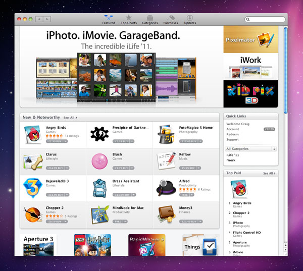
So the Mac App Store just showed up as part of Mac OS X 10.6.6 (check Software Update if you don’t already have it installed). As expected, it pretty much confirms my thoughts that someone decided to shoot most of Apple’s designers some time around when brushed metal appeared, along with giving everyone at Cupertino a taste-ectomy. The app UI is just hideous, kicking conventions in the bollocks, laughing in the face of clarity, and mercilessly setting fire to UX and pushing it off a cliff.

Here’s what it looks like (with an front-page app slot shown at full size):

There are two major problems with the Mac App Store as it stands:

The toolbar. The Mac App Store lacks a standard toolbar for dragging the window about. Instead, it shoves the window controls, navigation and search field into a non-standard chunky toolbar. This is bad on several levels:

  • There’s no standard ‘blank’ drag strip, enabling you to drag the window about. Instead, you must aim for and click specific blank areas between the various navigation items. This reduces usability and also obliterates accessibility for users who have less dexterity.
  • The window controls are positioned in a different place to usual. This screws up muscle memory for Mac users used to ‘snapping’ to specific points to interact with controls. (Consistency is a cornerstone of good application design. It enables users to intuitively know how to interact with things. Apple is one of the worst offenders for breaching Mac OS X interface guidelines, despite chiding third-party developers for doing so).
  • The window controls and primary back/forward navigation buttons are close together in terms of horizontal spacing, which may lead to accidental window zooming when attempting to navigate ‘back’. (Compare this to Safari, where the navigation controls are at the far left of the window.)

Still, Adobe might be happy, since Apple’s effectively validated the dire ‘Application Frame’ in the Creative Suite applications by doing the same thing itself (i.e. icons in the toolbar).

Clarity. I zoomed the Angry Birds box for a reason. Look at the price tag. It’s pretty indistinct and not easy to read. When slightly darker on a mouseover… well, it’s still pretty indistinct and not easy to read. Perhaps this is intentional, with Apple trying similar mind games to those used on restaurant menus. To me, it just looks like poor design. Someone liked the shade of grey and small text and went with it, rather than thinking if it offered enough contrast and clarity (a problem relatively common throughout the application). It reminds me of an era of web design, where designers became infatuated with small grey text on slightly darker grey backgrounds. And like many web pages of old, you of course cannot zoom the text in the Mac App Store.

I should point out that in terms of general use, the Mac App Store is fine. Applications download and install with a single click, and the process seems flawless. The clarity issue also improves somewhat on individual application pages (although the layout here is, to be kind, a total mess, like someone’s just slapped a wireframe together and a lazy boss has gone “yeah, whatever”). Furthermore, Apple’s also done some extremely aggressive pricing on its own products, which is great to see and should encourage more people to buy rather than copy software.

However, Apple used to stand for more than ‘good enough’ when it came to design in computing. While this is something that certainly still exists in Apple’s perfectionist approach to hardware design, something’s gone very wrong with its software interface design. Apple is fast becoming one of the worst developers in this area on its own platform.

January 6, 2011. Read more in: Apple, Design

45 Comments

« older postsnewer posts »