Accessibility and Apple: dizziness by a thousand cuts

Very long-time readers of this blog may remember my first encounter with vestibular triggers in software. OS X Lion had full-screen animations, and they made me sick. Alas, I was no John Gruber or Jason Snell. I received a few emails and notes of concern, but the post got no real traction. 18 months later, I wrote about iOS 7 making some users sick – but that was for The Guardian. And that one made a difference, in every sense.

The story spread, but also – and far more importantly – Apple started listening. I and others sent over recommendations. Changes were made. iOS 7 became usable again for millions of people. But one thing has never changed: this aspect of accessibility has apparently never become a foundational part of Apple development, and is instead reactive.

What this means for me is trying to catch the worst vestibular triggers that occur during the summer betas, and hoping they’ll get fixed. Or after September, begging Apple to fix those that remain. Or when that doesn’t happen, trying to remember the triggers that still exist and avoiding related pieces of the operating system entirely. (For example, in Control Centre, tap on Focus and the menu blasts outwards. For you, that may look nice. For me, it’s the fast train to dizzy central.)

Over on Mastodon, Federico Viticci has been writing a lot about iOS and iPadOS. I’m sure you’re familiar with him; if not, I’d say he’s one of the foremost iOS and iPadOS experts in the entire world. He digs deep every single year, writing book-sized reviews on the new systems as they appear. The sheer effort, enthusiasm and sense of detail is really quite something.

He and I appear to be in very different spaces this year, though, with my position on Liquid Glass being significantly more negative. I see gloss – a pretty tech demo that also serves to significantly erode usability and legibility. But because Apple doesn’t bake in vestibular accessibility at a foundational level, the changes being made in Liquid Glass also impact accessibility.

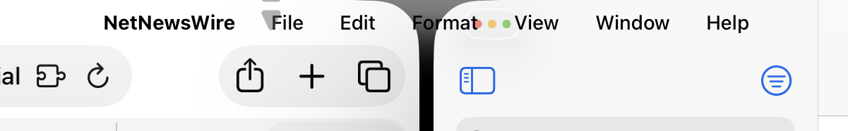
In the Mastodon thread, Viticci noted that iOS 26 now collapses toolbars and it takes an extra tap to perform some actions. He asks: “Is that…better? The animations are gorgeous, sure. But does it actually work better?” To which I’d say: no. Twice.

From a usability standpoint, this is a step back. It’s not simplifying UI, but hiding it. From an accessibility standpoint, the revision is also a problem.

The guidance I – and, I’m sure, others – have provided multiple times to Apple is that motion that cannot be controlled by the user should ideally be removed; which, in reality, has meant being replaced by a crossfade – good enough for most users with vestibular issues. You’ll see this if you activate Reduce Motion on your iPhone. The 3D zoom ‘blast’ when opening folders will be gone. As will other animations, such as when you move through menu hierarchies. (At least in software that doesn’t use its own proprietary animations that ignore Reduce Motion, such as RSS client Reeder.)

What people often don’t realise is that even small/fast pop-out menu animations can be enough to ‘blast’ someone to the point they can be made dizzy. Additionally, transforming static to animated UI via refraction is a potential trigger. (For example, when playback controls start animating because the content beneath them is being refracted.) Both of those things are strewn throughout all of Apple’s upcoming operating system revisions. Beyond that, there are bigger issues too, such as the current iPadOS 26 dev beta windowing having zooming/flyout animations when you tap on the ‘desktop’. If I accidentally watch that, I’m dizzy for minutes. Other people have it much worse than I do.

Online, I tend to get one of three responses to this kind of feedback. The first is from people who don’t believe me, on the basis that I write about Apple kit and also play video games. But vestibular conditions are weird and can be quite specific. I can safely ride rollercoasters, if I’m careful. I can play some games, notably when I’m in control and can anticipate upcoming camera movement. But when watching someone else play or using a UI that blasts animations in front of my face, I can be left uncomfortable for hours.

The second is the people who say “yeah, but that’s what betas are for”, which misses the point. As noted earlier, it’s not like Apple is unaware of motion problems. And, to be fair, the iOS team in particular has been responsive to requests I’ve made. I’d say, roughly, the order then goes iPadOS, macOS, watchOS, and tvOS, with the last of those systems being very poor in terms of making things more usable in this space. More broadly, even though Apple is better than rivals when it comes to this area of accessibility, fixes are not proactive and ensured by default – Apple is too often reactionary, in response to feedback. And that’s a problem.

The third type of response? Those come from people like me. People who suffer from this weird condition and just want to use their devices without fear. It’s absurd using an iPad and having to remember to shut your eyes during every transition, just in case, as I once had to. It’s ridiculous to be scared of installing a new operating system, in case random animations haven’t been dealt with. So big or small, animations should be stilled from day one if a user has Reduce Motion turned on. This should be foundational. It shouldn’t even require feedback. But if that feedback is provided, that is absolutely what should ship come September. Let’s see if that will be the case this year.

July 13, 2025. Read more in: Apple, Opinions

3 Comments

Apple’s menu bar madness in macOS 26 and iPadOS 26

iPadOS 26 two window set up, with barely legible menu bar.

I have issues with Apple’s current design trajectory. There’s a lot of gloss – style over substance – with Liquid Glass. While I appreciate some refinements, like the quiet exit of the Home indicator, the more I use macOS 26 and iPadOS 26, the more I question where Apple’s heading.

Historically, Apple has been opinionated and confident in its graphic design. More often than not, it’s also made good decisions. There are exceptions, but the Mac survived and later thrived by marrying beauty and usability. Similarly, the iPhone would never have become a giant in mobile computing if iOS hadn’t looked great and been easy to use. Today, though, Apple too often feels lost when it comes to design.

This sense of unease can be shown by focusing on one key component: the menu bar. This element has been a vital part of the Mac since the platform’s earliest days, helping users quickly and efficiently access commands and controls.

In the first macOS 26 dev beta, Apple removed the menu bar background entirely. Menu bar text and icons suddenly floated above whatever was behind them, dramatically reducing legibility – something that plagues Apple design right now, due to Apple’s obsession with Liquid Glass. Using Reduce Transparency brought the background back, but no one should be reliant on accessibility settings for basic legibility.

In beta 2, Apple added an option to restore the menu bar background. Which is good. Except it also makes me question Apple’s confidence in its design work. When Apple starts hedging its bets, it signals that it knows something is wrong, but lacks the conviction to course-correct. Or perhaps such settings are a means to temporarily shut people up, while default choices reveal the true intent and direction of travel.

On iPad, things are even worse. I’m a fan of the new windowing system, but the menu bar implementation is dreadful. The problem isn’t its auto-hide behaviour – the Mac has had something similar (although off by default) since 2015. Again, the issue is that Apple is so enamoured with transparency that it’s sacrificing visual clarity.

Unfortunately, the ‘fix’ on iPad isn’t yet anywhere near as full as the Mac one. In beta 1, a two-up window view could see menu bar text vanish entirely. In beta 2, Apple added a subtle gradient, which barely helps. Honestly, this is embarrassing – the sort of thing a design student wouldn’t hand in as part of a project. A menu bar coming to iPad is great, but not if you can’t read its text.

I spent five minutes mocking up alternatives, one with a frosted glass effect and the other with a solid background. I’m very aware that they are far from perfect, and one commenter rightly suggested iPadOS would prefer a rounded rectangle menu bar background, like the Dock. But they still offer more clarity than Apple’s proposal. And that’s a problem, because basic foundational graphic design should be the starting point for operating systems many millions of people use every day. Design that lacks legibility shouldn’t make it off of the drawing board, let alone into a beta.

Fortunately, it’s still June. These operating systems won’t ship until September. There’s still time to fix all this. But Apple’s timid iPad tweak doesn’t suggest an eagerness to improve. If anything, it suggests a design team wondering: what’s the bare minimum we can get away with to quiet the complaints?

June 28, 2025. Read more in: Apple, Opinions, Technology

1 Comment

Is Reddit really the “best space left on the internet”? It depends.

Evil Reddit icon

A piece in the i Paper today – “Reddit is ugly and utilitarian – but it’s the best space left on the internet” – sings the praises of Reddit. It does so through the lens of writer Zing Tsjeng enjoying a site that doesn’t demand you “market yourself as popular, attractive or palatable”. But in later admitting the site “isn’t perfect, of course”, the piece misses the chance to dig deeper and therefore overlooks key issues with Reddit that aren’t immediately apparent.

I do agree with the i about certain benefits. Reddit being largely text-based is increasingly rare in an internet obsessed with video and brevity. It allows for – and often encourages – depth and discussion, due to being essentially a bunch of specialist forums glued together. Its algorithm isn’t great. But create an account and Reddit will mostly stick to things you actually want to see, rather than ‘doing a YouTube’ and rapidly steering you towards extremism. It stands in stark contrast to the instant gratification of TikTok or the endless void of AI-generated slop that is a modern Facebook feed.

But. The piece calls Reddit “one of the few remaining platforms safe from capitalism’s onerous demands”. It then, crucially, qualifies that statement with, “to market yourself as popular, attractive or palatable for the online gaze”. I say crucially, because that caveat is vital. It aligns with the piece’s objective: to position Reddit as a place where you can be yourself. But by narrowing the definition, that dodges some uncomfortable truths, which are some of the places where Reddit starts to go bad.

The piece claims that in being “[f]reed from the need to appeal to the algorithm or establish a personal brand, people can actually be themselves” and this “fuels the brutal honesty behind notorious confessional subreddits”. In some cases, this is true. But Reddit has a karma system, which is often ‘farmed’ (gamed), a process that has been accelerated by the onset of AI. Long-time users have watched, glumly, as many of their favourite subreddits (Reddit’s jargon for ‘dedicated forum’) slowly descended into a game of spot the AI post.

For the most part, automated posts (regularly recycled) are confined to those huge subreddits, because they are the best places to farm karma. But AI has impacted the site in other ways. Users increasingly copy-and-paste from ChatGPT, just as they do everywhere else online. But on Reddit, this erodes the platform’s reputation for expertise. I recently witnessed a surreal argument about handheld console specs, with someone doubling down on their inaccurate, clearly AI-generated information. The result? People bought into it and said they’d ‘upgrade’ to a device that in reality didn’t offer the claimed benefits. Quite why they didn’t research outside of Reddit is beyond me, but for some people Reddit is the internet, in the same way older folks barely leave Facebook. Regardless, it shows Reddit isn’t immune from AI.

In fact, Reddit the company is in very much in favour of AI, largely because it long ago realised it could sell Reddit content as training data. This is, remember, user-generated content. Without that, Reddit is nothing. But the users won’t see any of the spoils. And if this alone makes you question whether Reddit is one of the good guys, the platform’s attitude was laid bare during what Wikipedia calls the Reddit API controversy. In short, Reddit brutally went after third-party apps, such as the popular Apollo, made unfounded accusations against Apollo’s creator, and sparked a wave of subreddit blackouts. When the Reddit leadership’s patience wore thin, the company simply threatened to replace moderators if they didn’t reopen their subreddits – and then followed through. That ended any pretence the platform is meaningfully democratic or, for that matter, meaningfully different from its rivals.

None of this necessarily contradicts the i paper’s subjective claim that Reddit is the “best space left on the internet”. But even if you agree (and, for the record, I don’t), the conclusion must be that it’s merely the best of a very bad bunch.

June 23, 2025. Read more in: Opinions, Television

1 Comment

It’s hot in the UK. Really. Or: why it feels hotter in a UK summer than you might think

Blue sky with a tree branch coming into the left of frame.

You might have seen reports about a heatwave in the UK. Then you might have looked at the temperatures and thought: what? What? Readings this week have been in the high 20s, and where I live are predicted to top out at 31°C on Saturday. (That’s high 70s to high 80s in old money.) Surely that’s just… lovely? Bit of sun. Bit of warmth. Get over yourselves, wimpy British people!

But no. Because various factors add up to make things pretty uncomfortable here. We don’t, as a rule, have air conditioning. It’s increasingly common in cars. Some offices and shops (mostly supermarkets) will have some kind of cooling units. Often ineffective ones, mind. Homes? Vanishingly rare. And those homes? They’re designed to keep heat in. Mostly brick-built. Heavily insulated. Smallish windows. No air flow. And speaking of air flow, there’s not much of that either right now. No breeze at all. Plus, it’s humid, due to the UK being a weirdly shaped island surrounded by sea.

There’s no time to prepare and build resilience either. If you live in a place that’s very regularly hot, you become acclimatised. The UK, though, frequently flips seasons at almost any time of year. A week and change ago, we were tempted to put the heating back on in our house. With wind chill, the ‘feels like’ factor outside was in single figures (mid 40s, in ye olde degrees). During evenings, we were wearing fleeces and wrapping up in blankets. Now I’m sitting in my office, just after 9am, with a fan blasting into my face, watching the temperature readings on our smart radiator gadgets tick ever upwards. The windows are open and that’s doing nothing. Fans are on, which is basically blowing hot air around. Even nights aren’t helping, with their lack of breeze and temperatures stubbornly only briefly bottoming out in the high teens (mid 60s). And sunrises before 5am mean if you do leave the windows and curtains open, you’re going to wake up at stupid o’ clock.

Despite all this, I personally would take heat over murk. We often have ‘summers’ in the UK that amount to six weeks of cool grey. I am solar powered. I love the sun. But the heat can be tricky to deal with. And because of the various factors outlined above, not least the fact that for many people there’s just no ‘escape’, it can feel an awful lot more uncomfortable, stifling and intense than you’d otherwise realise from the temperature numbers alone. In short, it’s hotter than you might think. So maybe think a bit before rattling off yet another “pfft – the Brits are just wimps” post when, here in the UK, we all feel like we’re melting.

June 19, 2025. Read more in: Opinions

1 Comment

The quiet exit of the Home indicator in iOS 26 and iPadOS 26

To say iOS 26 and iPadOS 26 have been divisive is putting things mildly. Much of that is down to Liquid Glass, which at best needs a lot of optimisation before these operating systems ship later this year. But look beyond that and there’s a lot to like, the most notable revamped feature being vastly improved iPad windowing.

Often, though, it’s smaller changes that can make or break an operating system. And one change has me doing a happy dance: the Home indicator no longer scythes across the bottom of the screen, above the app you’re using. I’ve grumbled about the Home indicator for years. I wanted an off switch – the means to get rid of it for good. Because the last thing I need when playing a game, using a music app, or reading, is a distracting line lurking at the bottom of the screen.

In the ’26’ dev betas, Apple hasn’t provided an off switch in Settings, but it has introduced the next best thing. Actually, it’s arguably created something better. When you switch to an app, the Home indicator now elegantly fades. Further interaction with the app doesn’t make it reappear. Instead, you have to make a deliberate upwards swipe from the bottom of the screen to bring it back.

I’m no fan of hidden UI. Apple seems a bit obsessed with hiding settings, menus and tabs away, and that can make things difficult for people. But just this once, I’m going to make an exception, because the interface element I least liked on iPhone and iPad is no longer an irritant and a nuisance – it’s there when I need it and gone when I don’t.

Edit: As per a comment I received, I should note that the ability to switch between apps with a swipe at the very bottom of the display remains, regardless of whether the Home indicator is visible. So what Apple has removed is the visual distraction, not the functionality. When you swipe, the indicator immediately reappears.

June 13, 2025. Read more in: Apple, Opinions

5 Comments

« older posts