Weeknote: 13 July 2025 – Neo Geo, Frankie, accessibility, Liquid Glass, and more

Neo Geo Super Pocket in front of an AES console, with Metal Slug graphics dotted about.

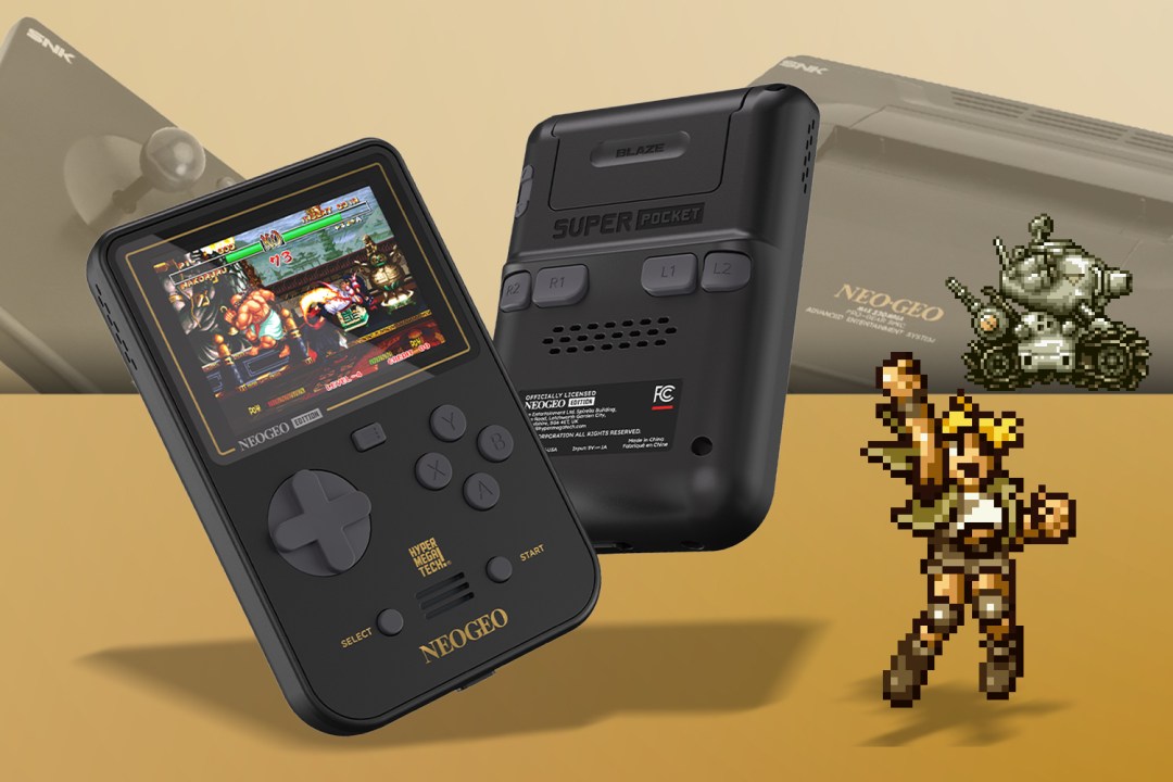
Today’s consoles are cheap. Seriously. Over at Stuff, I remark how the Neo Geo Super Pocket finally gives me the console I could never afford as a kid. The starting point for this column was remembering that my first true gaming love, the C64, cost 400 quid back in the early 1980s. That’s the equivalent of £1400 today. Blimey. Anyway, the new Super Pocket is fab – and at pocket-money prices. Grab one.

Frankie Goes To Hollywood is 40. Not the band, which formed in 1980, but the game. Rocking up just after the band’s peak, Ocean’s title – which gaming legend Julian Rignall reminisced about on Bluesky – could so easily have been a half-arsed piece of junk to satisfy a license. But creator Denton Designs went above and beyond, crafting a unique mix of adventuring, mini-games and strategy that was years ahead of its time, and still in many ways stands up today.

The basic premise finds you exploring nondescript terrace houses, looking for clues to solve puzzles. In an era of text adventures, this foreshadowed Lucasfilm point-and-click games. If you found a tape, you could insert it into a VHS deck and start a mini-game. There were ten in all. Some were topical, such as Reagan and Gorbachev spitting at each other in a surreal take on those old Wild West shooter games. Some were surreal. One was disarmingly beautiful. 

There was so much more too, from a murder mystery to solve to a cat to feed. The extreme to the mundane. All to create a game about a pop band. If nothing else, Frankie Goes To Hollywood – on the 8-bit platforms that had 64k or under to play with – serves as a fantastic reminder of the magic that can happen when dev teams go above and beyond. Watch a video of the C64 version.

Accessibility and Apple: dizziness edition. I’m still concerned about the dev betas and how they’ll be this September. So I wrote about it, outlining Apple’s approach to vestibular accessibility (better than most, but still falling short), and responded to the three types of feedback I usually receive for these posts.

Also, I still hate Liquid Glass. We’re weeks into beta season now, and to me it still looks like a knock-off Android skin. It’s the first Apple OS I vehemently dislike to the degree I don’t want to use it. But on the Android thing, a thought struck me. I have the Android 16 beta on my Pixel, and this is the first time I’ve found I like Android’s visual design a whole lot more than the iPhone’s, but also where I’ve been frustrated about shortcomings in the flexibility and customization of Android compared to iPhone. Notably (and I know Android folks may disagree), I much prefer iOS widgets. And Control Centre is still far ahead of Quick Settings. I’m not saying the two operating systems have ‘switched places’; but it is interesting that Apple is no longer the obvious leader in terms of design, and Android isn’t always out front regarding flexibility.

Want to write on an iPhone? Probably not. But it’s a device millions of people always have on them. So when inspiration does strike, use the tips in my updated writing toolkit.

Social media is a mess. So here are some of my favourite iPhone apps to help you consolidate social media and your wider reading.

Why is Mail still in the Dark Ages? This column looks at the current Apple operating system betas, does a happy dance in the direction of Phone and Messages triaging spam, and then asks why Mail is so pitiful at doing the same.

Dark Nebula joins my iPhone classics series. I always loved this game, which is like if Bounder and Marble Madness had a baby. I’d love to see an updated version of it and the sequel on Apple Arcade. HINT HINT ETC.

July 13, 2025. Read more in: Weeknotes

Comments Off on Weeknote: 13 July 2025 – Neo Geo, Frankie, accessibility, Liquid Glass, and more

Accessibility and Apple: dizziness by a thousand cuts

Very long-time readers of this blog may remember my first encounter with vestibular triggers in software. OS X Lion had full-screen animations, and they made me sick. Alas, I was no John Gruber or Jason Snell. I received a few emails and notes of concern, but the post got no real traction. 18 months later, I wrote about iOS 7 making some users sick – but that was for The Guardian. And that one made a difference, in every sense.

The story spread, but also – and far more importantly – Apple started listening. I and others sent over recommendations. Changes were made. iOS 7 became usable again for millions of people. But one thing has never changed: this aspect of accessibility has apparently never become a foundational part of Apple development, and is instead reactive.

What this means for me is trying to catch the worst vestibular triggers that occur during the summer betas, and hoping they’ll get fixed. Or after September, begging Apple to fix those that remain. Or when that doesn’t happen, trying to remember the triggers that still exist and avoiding related pieces of the operating system entirely. (For example, in Control Centre, tap on Focus and the menu blasts outwards. For you, that may look nice. For me, it’s the fast train to dizzy central.)

Over on Mastodon, Federico Viticci has been writing a lot about iOS and iPadOS. I’m sure you’re familiar with him; if not, I’d say he’s one of the foremost iOS and iPadOS experts in the entire world. He digs deep every single year, writing book-sized reviews on the new systems as they appear. The sheer effort, enthusiasm and sense of detail is really quite something.

He and I appear to be in very different spaces this year, though, with my position on Liquid Glass being significantly more negative. I see gloss – a pretty tech demo that also serves to significantly erode usability and legibility. But because Apple doesn’t bake in vestibular accessibility at a foundational level, the changes being made in Liquid Glass also impact accessibility.

In the Mastodon thread, Viticci noted that iOS 26 now collapses toolbars and it takes an extra tap to perform some actions. He asks: “Is that…better? The animations are gorgeous, sure. But does it actually work better?” To which I’d say: no. Twice.

From a usability standpoint, this is a step back. It’s not simplifying UI, but hiding it. From an accessibility standpoint, the revision is also a problem.

The guidance I – and, I’m sure, others – have provided multiple times to Apple is that motion that cannot be controlled by the user should ideally be removed; which, in reality, has meant being replaced by a crossfade – good enough for most users with vestibular issues. You’ll see this if you activate Reduce Motion on your iPhone. The 3D zoom ‘blast’ when opening folders will be gone. As will other animations, such as when you move through menu hierarchies. (At least in software that doesn’t use its own proprietary animations that ignore Reduce Motion, such as RSS client Reeder.)

What people often don’t realise is that even small/fast pop-out menu animations can be enough to ‘blast’ someone to the point they can be made dizzy. Additionally, transforming static to animated UI via refraction is a potential trigger. (For example, when playback controls start animating because the content beneath them is being refracted.) Both of those things are strewn throughout all of Apple’s upcoming operating system revisions. Beyond that, there are bigger issues too, such as the current iPadOS 26 dev beta windowing having zooming/flyout animations when you tap on the ‘desktop’. If I accidentally watch that, I’m dizzy for minutes. Other people have it much worse than I do.

Online, I tend to get one of three responses to this kind of feedback. The first is from people who don’t believe me, on the basis that I write about Apple kit and also play video games. But vestibular conditions are weird and can be quite specific. I can safely ride rollercoasters, if I’m careful. I can play some games, notably when I’m in control and can anticipate upcoming camera movement. But when watching someone else play or using a UI that blasts animations in front of my face, I can be left uncomfortable for hours.

The second is the people who say “yeah, but that’s what betas are for”, which misses the point. As noted earlier, it’s not like Apple is unaware of motion problems. And, to be fair, the iOS team in particular has been responsive to requests I’ve made. I’d say, roughly, the order then goes iPadOS, macOS, watchOS, and tvOS, with the last of those systems being very poor in terms of making things more usable in this space. More broadly, even though Apple is better than rivals when it comes to this area of accessibility, fixes are not proactive and ensured by default – Apple is too often reactionary, in response to feedback. And that’s a problem.

The third type of response? Those come from people like me. People who suffer from this weird condition and just want to use their devices without fear. It’s absurd using an iPad and having to remember to shut your eyes during every transition, just in case, as I once had to. It’s ridiculous to be scared of installing a new operating system, in case random animations haven’t been dealt with. So big or small, animations should be stilled from day one if a user has Reduce Motion turned on. This should be foundational. It shouldn’t even require feedback. But if that feedback is provided, that is absolutely what should ship come September. Let’s see if that will be the case this year.

July 13, 2025. Read more in: Apple, Opinions

3 Comments

Weeknote: 5 July 2025 – Android 16 desktop mode, widgets, AI, and a cow

Android 16 desktop mode, showing a phone running a large display

One device to rule them all‽ That’s the subject of my Stuff column this week: I’ve used Android 16’s desktop mode – and now I’m frustrated with my iPhone. I’ve written about ‘phones as desktops’ before, and it’s a subject that somehow manages to annoy just about everyone. But I really like the idea of a phone that can become your primary device, plugging into accessories as and when it’s necessary. But even if that doesn’t work for you, Google’s efforts with Samsung are important for at least two reasons. First, in baking a desktop mode directly into vanilla Android, devs will be encouraged to make apps that are more flexible, and they will thereby better support more varied devices, such as foldables. Secondly, maybe – just maybe – it might prompt Apple to bring its really rather good iPad windowing model to iPhone. Although I’ll be bloody amazed if that happens any time soon. Apple doesn’t want you buying fewer Apple devices, after all. The notion people could just buy one would give Apple’s entire finance team heart palpitations.

Need a widget wizard? Probably not, but if you use an iPhone or an iPad, app Widget Wizard might be worth a look. In my deep dive for TapSmart, I outline how I use the app myself. The agenda widget is especially handy.

Google search AI results continue to suck. I’d naively thought people would push back against this feature, after all the terrible press. But Google just manually weeds out the worst cases, which means millions and millions of slop answers are copied and pasted daily. I recently watched online as people started arguing about the specs of a device that had ostensibly received an update. In reality, it was a new model but had the same guts. Google AI didn’t know this, because it doesn’t ‘know’ anything and duly served up some hallucinations a fan of the brand pasted into a forum thread – and then doubled down on. Absurdly, this convinced a couple of people to spend actual money. I suspect they’re not going to be so thrilled when they find they own two devices with identical specs but slightly different shells. Sigh.

Em dashes aren’t evil. Over on Bluesky, Leena said she won’t change how she writes in case someone might doubt she’s human. Her thread adds that some GenAI tropes exist because the tech mimics good human writing. The thing is, editors are already getting twitchy. I’ve had two more or less ask me to omit em dashes from my own work, because they’re concerned about people claiming copy their orgs run may in any way be AI-generated. Thing is, at some point the tech bros will tweak the algorithm (“Use fewer em dashes!”) and then what? So to fight this stuff, we just have to be better. Which in the case of most GenAI writing means not sounding like mediocre marketing copy (or, for socials, not overusing bullet points and spraying emoji about like confetti).

A cow on a path

I met a cow. It was a nice cow, in a place cows are not supposed to be. Top tip: if you meet a cow, be kind to the cow. Avoid the cow. Give the cow space. Don’t, say, like people I saw that day, almost sneak up on the cow from behind because you “like cows”. Doubly so when said cow has massive horns that might puncture human flesh. (That didn’t happen in this case. And the cow was shortly ‘rescued’ by local rangers and returned to her field. But good grief at some people.)

July 5, 2025. Read more in: Weeknotes

Comments Off on Weeknote: 5 July 2025 – Android 16 desktop mode, widgets, AI, and a cow

Weeknote: 28 June 2025 – BSOD, mobile gaming, Apple design, blinding lights, Trump Phone, and more

Blue Screen of Death

Microsoft is killing the Blue Screen of Death. In my piece for Wired, I take a trip down memory lane to wave goodbye to the iconic screen we all love to hate. (Spoiler: there will still be a BSOD, but the B will stand for something new.)

Even Hades couldn’t save Netflix Games. Is mobile gaming doomed? Betteridge-baiting headline aside, this column for Stuff dives into my thoughts on mobile gaming, from its earliest days to the huge problems this side of gaming now faces. In my view, it’s – as ever – all about money.

The HDMI spec now includes 16K. Which is clearly bonkers. At least, I argue that point in my head-to-head opinion over on Stuff. Fighting on behalf of screens with more pixels than atoms in the universe (or something): Tom Morgan-Freelander.

The Trump Phone keeps changing. Wired notes it’s already a lot different from one week ago. Absurd, given that people are preordering something that still lacks defined specs. A week and change ago, I suggested the following over at Stuff: “It’s also unclear whether the phone will ever exist in reality. But if it does, millions of idiots will buy one. Are you one of them?” I wasn’t expecting to be proved right so quickly.

Apple design now baffles me. The company sometimes claimed it had more taste than it actually had. Brushed Metal won’t go down in history as gorgeous design. But something feels very wrong over Cupertino way. Sure, the macOS Finder icon is now 73% less hideous. But Liquid Glass has so many problems, the new alarm design on iOS is abysmal, and then there are the menu bars. Yikes.

From WFH to WTF. Anuj Ahooja over on Mastodon said: “In the last five years, we’ve gone from ‘employees will never have to go into an office’ to ‘employees need to be in the office because creative and innovative work can only be done face-to-face between humans‘ to ‘lol we don’t need humans’.” It’s an astute observation and the path we’ve travelled is like double whiplash. It’s quite something that while people were fighting managers to retain rights from covid that were one of its few benefits, many managers reasoned they could do away with people entirely.

Blinding lights are bad. It’s been hot in the UK, and so we have fans in almost every room now. And they all appear to have been equipped with an LED that could be redeployed as a floodlight. So it’s a good time to celebrate the one-year anniversary of a Stuff column: Dear all tech companies: stop adding obnoxious eye-searing lights to gadgets. (Reader: they did not stop. They will never stop.)

June 28, 2025. Read more in: Weeknotes

1 Comment

Apple’s menu bar madness in macOS 26 and iPadOS 26

iPadOS 26 two window set up, with barely legible menu bar.

I have issues with Apple’s current design trajectory. There’s a lot of gloss – style over substance – with Liquid Glass. While I appreciate some refinements, like the quiet exit of the Home indicator, the more I use macOS 26 and iPadOS 26, the more I question where Apple’s heading.

Historically, Apple has been opinionated and confident in its graphic design. More often than not, it’s also made good decisions. There are exceptions, but the Mac survived and later thrived by marrying beauty and usability. Similarly, the iPhone would never have become a giant in mobile computing if iOS hadn’t looked great and been easy to use. Today, though, Apple too often feels lost when it comes to design.

This sense of unease can be shown by focusing on one key component: the menu bar. This element has been a vital part of the Mac since the platform’s earliest days, helping users quickly and efficiently access commands and controls.

In the first macOS 26 dev beta, Apple removed the menu bar background entirely. Menu bar text and icons suddenly floated above whatever was behind them, dramatically reducing legibility – something that plagues Apple design right now, due to Apple’s obsession with Liquid Glass. Using Reduce Transparency brought the background back, but no one should be reliant on accessibility settings for basic legibility.

In beta 2, Apple added an option to restore the menu bar background. Which is good. Except it also makes me question Apple’s confidence in its design work. When Apple starts hedging its bets, it signals that it knows something is wrong, but lacks the conviction to course-correct. Or perhaps such settings are a means to temporarily shut people up, while default choices reveal the true intent and direction of travel.

On iPad, things are even worse. I’m a fan of the new windowing system, but the menu bar implementation is dreadful. The problem isn’t its auto-hide behaviour – the Mac has had something similar (although off by default) since 2015. Again, the issue is that Apple is so enamoured with transparency that it’s sacrificing visual clarity.

Unfortunately, the ‘fix’ on iPad isn’t yet anywhere near as full as the Mac one. In beta 1, a two-up window view could see menu bar text vanish entirely. In beta 2, Apple added a subtle gradient, which barely helps. Honestly, this is embarrassing – the sort of thing a design student wouldn’t hand in as part of a project. A menu bar coming to iPad is great, but not if you can’t read its text.

I spent five minutes mocking up alternatives, one with a frosted glass effect and the other with a solid background. I’m very aware that they are far from perfect, and one commenter rightly suggested iPadOS would prefer a rounded rectangle menu bar background, like the Dock. But they still offer more clarity than Apple’s proposal. And that’s a problem, because basic foundational graphic design should be the starting point for operating systems many millions of people use every day. Design that lacks legibility shouldn’t make it off of the drawing board, let alone into a beta.

Fortunately, it’s still June. These operating systems won’t ship until September. There’s still time to fix all this. But Apple’s timid iPad tweak doesn’t suggest an eagerness to improve. If anything, it suggests a design team wondering: what’s the bare minimum we can get away with to quiet the complaints?

June 28, 2025. Read more in: Apple, Opinions, Technology

1 Comment

« older postsnewer posts »