The Daily Mail versus Scrabble DS

Game turns child into evil swearing little shitbag

As part of its long-standing quest to vilify every videogame ever produced (in fact, everything fun ever created), righteous hatemonger ‘newspaper’ the Daily Mail earlier this week published a story about a mother’s fury over a Nintendo DS Scrabble game that taught her son “vile swear words”. (And in the Daily Mail’s usual sterling reporting, it’s amusing to note that the game in question is Scrabble 2007—there’s nothing like getting the scoop on a new product, and this article is nothing like getting a scoop on a new product.)

Of course, it’s implausible that Mrs Carrington’s eight-year-old could have discovered these words by any other means. Although it’s not mentioned in the article, it’s safe to assume that he’ll now need life-long counselling having been exposed to ‘toke’, ‘tits’ and ‘shit’. (Choice quote: “Shit had come up as well. I was absolutely mortified.” I’ll bet. You don’t want shit coming up when you’re playing a videogame—it can really knock you off your stride.)

Following Britain’s typical dive into knee-jerk reactionism, the mother has now banned her son from playing the virtual wordgame, which has been linked to people becoming slightly more educated, and is therefore reprehensible and evil. Publisher Ubisoft’s response about the ‘junior’ option that removes naughty words was met by a typically Daily Mail-style retort from Carrington: “I read the booklet that came with it, and there was no mention of a junior version. It should be made much clearer.” This is fair enough—after all, it’s really hard to spot the ‘Junior mode’ checkbox that’s directly under the player’s name when you’re picking a profile on first launching the game.

Translation: “I can’t be arsed to play real Scrabble with my son, so I threw this game at him, without actually bothering to in any way check it first. And now my little baby is surrounded by tits and shit, and the only way to deal with this is to get those true bastions of public decency and morality involved—the Daily Mail”.

My opinion: it’s a fucking disgrace. (Now, had she moaned at length about Scrabble 2007’s lack of single-console multiplayer support, I’d have been right behind her. IN A NON-OFFENSIVE MANNER.)

Daily Mail Scrabble

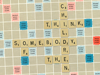
A Daily Mail-approved Scrabble game in progress.

December 11, 2008. Read more in: Gaming, Humour, News, Nintendo DS, Opinions

6 Comments

Helpful hints for 40 mph drivers

Zoom (brake), zoom (brake), zoom!

1. Speed up!

It might have escaped your notice, but your speedometer has some numbers on it that are greater than 40. This is because your car is actually capable of travelling faster than 40 mph. Therefore, if you happen to stumble upon, say, a motorway, while ambling about, oblivious to the world, you are allowed to drive above 40, and will thereby have fewer fellow road users cursing the very day you were born.

2. Slow down!

OK, so I know this one is going to confuse you, since I just told you to speed up, but you know when you entered a built-up area and saw that big, round sign with a red border that had astonishingly clear ‘3’ and ‘0’ figures in? Well, that was to tell you the maximum speed allowed in that area.

This will probably be a big shock to you, but when you’re faced with a 30 mph speed limit, the ’30’ does not in fact mean ‘carry on at 40’. The aforementioned sign should have alerted you to this simple fact. If not, just watch out for frightened children darting out of the road and scowls from angry pedestrians in future, and take that as an indication that you’re a total idiot who’s driving too fast down a high-street.

3. Speed up!

Yeah, I know—you’re probably thinking “make your mind up”, but here’s the thing: cars don’t topple over when you go around a really slight corner during your 40-mph mission. You don’t need to brake at every single bend, especially if your car is barely moving at that point. Now, I’m not suggesting careering round a hairpin bend at 40, just that your brain doesn’t go: “Corner ahead. Must brake for no discernible reason,” every single time.

4. Enjoy the pretty orange lights

A quick final tip: you probably won’t have noticed this, but there are a bunch of orange lights stuck to your car, towards the sides. These are called ‘indicators’ and they are used to indicate your intentions. They’re not there to make your car a bit prettier, nor to tell someone all about the exciting manoeuvre you just made.

November 7, 2008. Read more in: Helpful hints, Humour, Opinions

4 Comments

Helpful hints for touring comedians—dedicated to Steve Hall

These aren’t tears of joy—they’re tears of pain

1. Refresh your material

Yes, your material is clearly the funniest thing known to man, and it bears repeating to everyone on the face of the planet, including undiscovered tribes in the deepest, darkest reaches of the jungle. But here’s the thing: when I’ve already paid to see you live last year, in an entirely different tour, and you come on stage, mentioning that you were part of the last tour and are lucky enough to be included in this one, it’s probably best to actually have something new to say.

This might surprise you, but while repeats are bad enough on television, they’re far more annoying than a billion Janet Street Porters when you’ve paid 20 quid per ticket to watch a word-for-word regurgitation of a year-old act.

2. Adapt your material with care

I know I’m probably being ungrateful here, and that you should in fact be able to go on stage, play a tape recording of your act, and just read the paper and drink beer in front of me, but what I’d actually like to see is something unique and original. When you clearly have in your canned script ‘insert current location here’, it makes me want to insert something into you, like a really sharp stick into a nervous-looking eye.

To take an example—entirely at random, obviously—if a certain support act were to happen upon an Aldershot venue and try to do jokes about the town, don’t fire off the exact same jokes with the same generic information that you used a year ago when doing the exact same act in a totally different venue a number of miles away. It just makes you look like a lazy git—and, frankly, if you can’t come up with some new material for a 25-minute support act during an entire year, I think those dreams of playing Wembley Arena should be shot to pieces right now.

3. Refresh your material

Yes, your material is clearly the funniest thing known to man, and it bears repeating to everyone on the face of the planet, including undiscovered tribes in the deepest, darkest reaches of the jungle. But here’s the thing: when I’ve already paid to see you live last year, in an entirely different tour, and you come on stage, mentioning that you were part of the last tour and are lucky enough to be included in this one, it’s probably best to actually have something new to say.

This might surprise you, but while repeats are bad enough on television, they’re far more annoying than a billion Janet Street Porters when you’ve paid 20 quid per ticket to watch a word-for-word regurgitation of a year-old act.

October 4, 2008. Read more in: Helpful hints, Humour, Opinions

2 Comments

Helpful hints for Flash website creators

Before I smash my Mac over your head

1. Automatically resizing my browser window

I realise you’re proud of your creation and restricting it to the absolute boundaries of my monitor is, frankly, an insult to your amazing talents. Clearly, if all was well with the world, your website would somehow be the latest man-made object to be visible from space.

But here’s the thing: when you resize my browser window, which, I hasten to add, I’ve sized exactly how I want it, it makes me want to claw your eyes out with a rusty spoon. It’s probably something you haven’t considered, but I’m actually quite capable of dragging a window-resize widget.

2. Background music

Look, I know that you’re ‘down with da kidz’, and keep abreast of every trend, niche and passing fad in the music industry, and I fully understand that your tastes are impeccable. But when I visit your website and you force me to listen to an infinitely repeating five-second loop of compressed, painfully in-vogue dance music, it makes me want to come round to your house at three in the morning and play Captain Beefheart through your letterbox. And when you don’t provide any option for turning said music off, you instantly confirm yourself as the person who’ll be first up against the wall when the revolution comes.

3. Making Flash equivalents to HTML

It might have escaped your notice, but HTML actually works rather well. You might think that making something in Flash when it could just as easily have been made in HTML ensures you retain your ‘web designer of the future’ crown, but it really doesn’t. It just makes you look like an idiot, and compels users to want to kill you when instead of getting their usual and extremely useful context menu upon right-clicking, they get Flash Player’s one instead.

4. Rebuilding pages on every load

Yes, your animation skills are unparalleled and make the combined forces of Pixar, Aardman and DreamWorks green with envy. And I know that you’re extremely proud of your logo spanging around the screen and your navigation items arriving one by one, like the cool kids showing up half an hour late at a party. The thing is, while I don’t mind seeing this once (well, actually I do mind, but it doesn’t make me want to hurt you), seeing it every single time I access a new page on your website makes me want to take a cheese grater to your gums.

5. Long loading times

This will be perhaps the biggest eye-opener of them all to you, but the reason I’m paying out for broadband, and the reason I consider broadband to be such an exciting technology, is because it makes things faster. When I used to have a Commodore 64, I hated it when things took ages to load. When I had a dial-up modem, I hated it when things took ages to download. Newsflash: I still hate it when things take ages to download.

When you think the web is ‘a bit like television’, or that I think your work is so great I’m willing to wait five minutes just to get a glimpse of it, or assume I have a web connection so fast that it would make government agencies weep and average routers melt under the sheer strain, it’s pretty clear reality has left your little world, and that you should just give up and spend the rest of your life in a dark corner working yourself into a sexual frenzy about just how big you can make multimedia files for web interfaces these days. But just leave me the hell alone while you’re doing it.

September 22, 2008. Read more in: Helpful hints, Humour, Opinions, Technology, Web design

4 Comments

Helpful hints for DVD producers

Before you all drive me utterly insane

1. Logos

I know this is going to come as a massive shock, but I’m not as excited nor as impressed by your shiny animated logo as you are. I’m also not particularly bothered by the logos of all 46 other companies involved in the making of the DVD.

Making me sit and watch your stupid logos shimmying around while annoying jingles play in the background and not enabling me to skip past them makes me want to set fire to your headquarters. Twice.

2. Trailers

Again, I think you’re going to be quite surprised by this, but when I’ve just paid real cash for one of your DVDs, what I actually want to see is the film or show I’ve paid for, not adverts for whatever else you’re trying to flog at the time.

What I’m significantly less happy about (and by ‘less happy’, I mean ‘about as happy as I’d be if an elephant decided to defecate on my keyboard right now’) is in not being able to skip, with a single button-press, past all of your jolly adverts and to the DVD’s main menu, you total gits.

3. Copyright notices

It may have escaped your notice, but when I’ve paid money for one of your DVDs, I’m therefore not a stinking, evil, nasty pirate scumbag. Therefore, I’d appreciate it if you didn’t insult me with patronising, unskippable, legally shaky copyright notices (“You wouldn’t steal a car!” Quite right, but copyright infringement and theft aren’t the same thing, dumbass.) when I’ve actually gone to the bother of buying your product, you dolts.

4. Animated intros

This will perhaps be the biggest revelation of all, but some people actually watch the DVDs they’ve bought more than once. And if they’ve bought a series, not only might they not want to watch an entire DVD in one go, but they might also want to later watch a particularly favourite episode. Therefore, although your 3D animator is probably very proud of their work, and you likely want to show that, yes, you care enough about a show to spend a few bucks on the menus, not letting me skip past the animated intros to menus and sub-menus is akin to repeatedly kicking me in the teeth, removing my remaining shards of teeth, nailing dentures into my gums, and then repeatedly kicking me in the dentures, just for good measure.

(South Park guys: your menus are particularly hateful—I really don’t want some unskippable 30-second out-of-context chunk of an episode to be shown prior to the menu options appearing. And the reason is because I’m just about to watch the actual episode, you complete buffoons.)

July 15, 2008. Read more in: Film, Helpful hints, Humour, Opinions, Technology, Television

4 Comments

« older postsnewer posts »