Review: Google Chrome (beta)

Needs more polish! (Sorry.)

Rating: 3/5

A week ago, I posted my thoughts on Google Chrome, based on Google’s press release and comic book. This got me my fastest-ever flame, in just ten minutes (way faster even than the negative response I got for the oft-misunderstood Why the new iMac sucks).

I put this down to not toeing the line. Everyone and his cat has jumped on the ‘Google is teh bestest’ bandwagon, and even Macworld—a Macintosh magazine—gushed over Chrome, giving it a four-star review before quietly conceding the point that one of Chrome’s negative aspects is perhaps that it’s not yet actually available on the Mac.

I’ve been a bit more cautious. Having reviewed practically every Mac and Windows browser under the sun for various magazines, I’ve arrived at the conclusion that they’re all deeply flawed in some way. That’s why Google Chrome’s distinct lack of innovation (despite claims to the contrary by various ignorant commentators) was something I’d have been willing to set aside had Google really been a best-of browser. Sadly, it really isn’t.

That’s not to say Google Chrome is bad, and on Windows it certainly grabs with relish the position of ‘best browser for beginners’. The minimal interface clearly borrows from Internet Explorer 7 and Opera, mashing the two together and offering a few handy extras, such as thumbnails of your most-visited sites on new tabs, bettering Opera’s equivalent feature by way of being updated as you surf.

Tab management is excellent, with you being able to reorder and drag them to and from windows with ease (take note, Safari), and although the address bar’s ability to root around your history and bookmarks to try and find a match for a text string is bettered by both Firefox and Opera, it’s still impressive enough to warrant a mention. That said, it’s a shame Chrome didn’t pinch Firefox’s tagging feature—I find that a much more efficient way to store and retrieve favourite websites.

Elsewhere, I found it hard to see what all the fuss is about. Using WebKit is great, but Chrome’s change of graphics engine over Safari has resulted in a slightly botched implementation, and so it actually supports less CSS than Apple’s browser (albeit advanced features not currently in general use). And in terms of usability, Chrome makes some odd decisions.

The lack of a title-bar is baffling. This is often used to aid users, providing an indication of the site they’re on, or even their location within a site. Since Chrome still sits within a window (rather than you being able to peer between tabs to your desktop), its omission makes no sense at all. The lack of menus makes more sense, although it remains to be seen how these decisions will affect the Mac version. Elsewhere, not being able to double-click the top-left corner of a window to close it will likely irritate many users, and the ‘chatty’ tab headings within the Options dialog are utterly hateful, not describing what’s found within.

Perhaps the biggest problem I had with Chrome, though, was that it’s not rock-solid stable. It actually locked up Windows, forcing a total reboot, on more than one occasion, and just the browser itself has locked up a good few times. For a product touting the importance of one tab never affecting another, this is something that won’t be acceptable in the final product, although it’s maybe to be expected for a beta.

Clearly, Chrome isn’t done yet, and so it’s perhaps unfair to compare it with the likes of Firefox, Opera and Safari. However, that’s the reality of the market Google’s entering into, and Chrome has to be more than merely good enough. The fact Chrome is about ‘picking the best bits’, copying and refinement, isn’t necessarily a bad thing, but it needs to get everything right, rather than offering another imperfect product. And when you’re cheerleading radicalism, it pays to actually be a bit radical as well.

I’ll revisit Chrome once it gets out of beta (which, judging by other Google products, might never happen), but for now, I’ll be jumping back to Firefox 3.

Google Chrome

Now That’s What I Call A Browser! 57.
September 10, 2008. Read more in: Rated: 3/5, Reviews, Technology, Web design

1 Comment

Google chrome—the ‘best of’ browser

You get the feeling someone’s spoiling for a fight in the browser race. Compared to the late-1990s pissing match between Microsoft’s Internet Explorer and Netscape Navigator, we’re now in a period of relative stability, and once Microsoft finally wheels IE 8 coughing and spluttering into the daylight, designers and developers will be able to code pretty much without hacks across all current browsers.

Bar Microsoft, what remains of the browser race is all about innovation, but as the Redmond giant has shown, ‘innovation’ can also mean waiting to see what others do and copying them. With Internet Explorer 7, Microsoft got all excited about ‘innovative’ features like tabs, which had been irrevocably welded to practically every other browser for years. And with Google essentially being the new Microsoft, should it have come as any surprise to see its upcoming browser project, the badly-named Chrome, pushing the innovation angle hard, and yet pilfering as much as possible from other browsers before anyone really notices?

At the time of writing, Google Chrome has yet to be revealed, bar the press release and a rather odd comic book. (Expect to see that adapted into a Hollywood movie starring Shia LaBeouf by November.) However, we can glean the following:

  • It’s based on WebKit (like Safari)
  • The so-called ‘special tabs’ are above the window (like Opera’s)
  • It offers thumbnails of recently visited websites (kinda like Opera’s Speed Dial)
  • It has a privacy mode (like Safari)
  • It has intelligent address bar auto-complete (like Opera and, to some extent, Firefox)
  • It has malware protection (like Firefox)

… And so on. In fact, bar its ability to launch web apps in standalone browser windows without browser junk, I failed to see a single piece of major innovation. (And even that idea isn’t really new—Prism and Fluid are single-site browsers. Chrome’s only addition is in making it easier to launch SSBs from the main browser itself, and then protecting them by ensuring all instances are separate processes.)

I should be livid about Chrome, shouting from rooftops and damning it to places where things are damned. Google is doing the thing I hate most: it’s a massive company, nicking other people’s ideas and smushing them together into a big ol’ sticky ball of best-of goo.

The thing is, having recently reviewed every major Mac browser for a Mac magazine and most PC ones for a Windows publication, it appears Chrome is exactly what I’ve been asking for. It’s picking the best bits, potentially killing that nagging feeling that you get when using one browser’s great feature and just wishing it had that other feature from that other browser. Whether that’ll be enough for me to get over that feeling of utter wrongness at seeing everyone else’s ideas compiled into the browser equivalent of a Now That’s What I Call Music compilation, only time will tell.

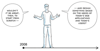
Google Chrome comic

It sure would, comic-book man. But why bother when you can steal everyone else’s ideas?

September 2, 2008. Read more in: Opinions, Technology, Web design

5 Comments

Web design matters: A better foundation

After posting Noise annoys, I started reading through the rest of my Practical Web Design columns, most of which rant about some area of web design that was irritating me at the time. I today unearthed a piece from way back in 2004, which—perhaps rather depressingly—remains totally relevant today: the way many web designers throw together sites in the likes of Dreamweaver, think it looks good enough, and then leave it at that.

As someone who’s hand-coded websites since 1996, it always amazes me how few web designers bother to learn the basics of their trade. But as my books on web design show, I feel that a strong foundation is essential in web design, and those designers who ignore this fact do so at their peril. (Note that Mark Boulton also regularly offers an interesting take on this subject, and his articles on grids and typography are essential reading for any serious web designer.)

Enjoy the article.

Craig Grannell explains that in the world of web design, ‘it looks good enough’ is simply ‘not good enough’.

Continue reading this post…

June 12, 2008. Read more in: From the archives, Humour, Opinions, Technology, Web design

Comments Off on Web design matters: A better foundation

Finding your way: .net 177 on navigation

Click! Click! ARGH!

I’m a tad late in mentioning it, but I was again fortunate this month to pen .net’s cover feature, which this time was about site navigation.

As is often the case, it’s inevitable that personal opinion creeps in to these things, even if I’m not quoted myself. Through the words of others, my own preferences were pretty evident in the piece: a love for intuitive, simple, carefully labeled and consistent navigation. Perhaps surprisingly, this didn’t mean saying nasty things about Flash, and although I bit my tongue a couple of times, Adobe’s ubiquitous technology got a good showing and not a hammering.

What was hard, though, was deciding on the best-in-show sites: ten examples of top-notch navigation, each of which happened to be different enough from the others to warrant inclusion. These days, I’m pretty easily annoyed by websites, and many have absolutely ghastly navigation in so many ways.

Overall, I’m pretty happy with the sites I chose, which included Guardian, Adobe, Wieden+Kennedy, Apple and the BBC. It’s notable, though, that even in these leading sites, there are major problems: the BBC’s effort to make mainstream user-personalisation of the navigation experience is hampered by dreadful bulky design conventions; and Apple’s no-nonsense approach is gradually being eroded by things like utterly hateful ‘activate on hover’ Ajax drawers.

Truly, no-one gets things perfect, but the general tendency now appears to be towards inconsistency and being too clever for your own good. After recent years of simplification and honing down, and with devices like iPhone showing how simple and efficient navigation can be, that’s a worrying trend to see.

.net 177 site nav

Are they trying to suggest we’re all talking a load of hot air? WE DEMAND THE TRUTH!

June 5, 2008. Read more in: .net, Magazines, Opinions, Web design

Comments Off on Finding your way: .net 177 on navigation

Web design matters: Noise annoys

Back in the dim and distant past, there was a publication called Practical Web Design. (Some might argue that there still is, but PWD is now a rebadged .net, for reasons far too long, boring and complicated to go into.) I regularly contributed to the magazine, which was, as its moniker suggests, heavily practical and all about web design. To finish each issue on a lighter note, I penned a humorous , ‘ranty’ and inconsistently capitalised column called ‘Web design matters’.

Despite these columns now being about three years old, many of them remain scarily relevant, and so because most people out there will have never seen them, and because my brain’s melted in the heat, thereby stopping me from writing something new today (bar this introduction, obv.), here’s a first dip into the archives, from issue 22 of Practical Web Design, which was unleashed on the world in October 2005. Judging by how many websites now inundate users with stupid noises, it appears that this particular column was digested and thoroughly ignored by many hundreds of awkward and contrary web designers the world over.

(Note: if any publisher wants to resurrect ‘Web design matters’ for their publication, drop me a line.)

As the old saying goes, ‘noise annoys’, but, as Craig Grannell discovers, that’s just how advertisers on the internet want it

Continue reading this post…

May 7, 2008. Read more in: From the archives, Humour, Opinions, Technology, Web design

4 Comments

« older postsnewer posts »